
You may have only 15 minutes on stage, and the opening moments set the tone for the rest of the talk. The gap between the time you are given and the attention you actually get is what separates presenters who are merely heard from those who are remembered. This guide covers the whole process, from the first blank slide to the last question in the Q&A session. By the end you will know how to structure the talk from opening hook to closing line, how to design slides that support your message without crowding it, which tools suit which context, how to use body language and voice to hold a room, how to make the talk accessible, and how to set up properly for a virtual conference so technical problems do not undercut your content.
Quick answer: To prepare a conference presentation, find out your audience and exact time slot, build the talk around one core message, design simple slides, rehearse out loud at least three times against a timer, and prepare answers to the questions you would least like to hear. Test your file and equipment before the session, whether it is in a room or online.
Ways to Prepare a Conference Presentation
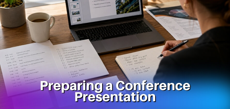
Preparing a conference presentation comes down to five core steps: know your audience, build a clear structure, design clean slides, practice out loud, and prepare for Q&A. The table shows when each one belongs in your schedule.
| Step | What to settle | When |
|---|---|---|
| Know your audience | Who is in the room, what they already know, your exact time slot | Before you write anything |
| Build the structure | One-sentence core message, then opening, body and close | Before you open a design tool |
| Design the slides | Light text, one idea per slide, a backup file | After the structure is fixed |
| Practice out loud | At least three timed run-throughs, one recorded | In the weeks before the event |
| Prepare for Q&A | The questions you would rather not get, with honest short answers | Once the content is final |
| Check the setup | Venue, equipment, or audio, camera and screen share | The day before, or at least 48 hours before for an online talk |
Audience analysis comes first. A room of academics expects citations and methodology; a professional conference crowd wants takeaways they can use on Monday. Your entire content structure should follow from that.
What Is a Conference Presentation and Why Does Preparation Matter
A conference presentation is a structured talk given to peers, professionals or researchers, either in person at an academic or professional conference or remotely at a virtual conference. The goal is to share findings, ideas or expertise in a fixed slot, usually 10 to 20 minutes depending on the event format.
That sounds simple. In practice it is one of the more demanding forms of public speaking, because the audience is knowledgeable, the schedule is tight, and your credibility is on the line in real time.
What a Conference Presentation Actually Involves
It is not just standing up and talking through slides. A well-prepared talk combines a clear content structure, a purposeful slide deck, practiced voice and body language, and readiness for the Q&A session at the end. Each of those pieces can break down on its own if you have not thought it through beforehand.
The format also varies by context. An academic conference typically expects formal language, cited sources and a structured research narrative. A professional conference leans toward practical takeaways and industry relevance. Knowing which one you are entering shapes your content, tone and slide design.
Why Preparation Makes the Difference
Preparation is not memorizing a script word for word. It is knowing your material well enough to deliver it smoothly, answer questions with confidence, and adapt when something goes wrong: a technical glitch, a shorter slot than expected, or an audience that already knows half of what you planned to cover.
Skipping structured preparation shows up in familiar ways: going over time, losing the audience halfway through, or freezing during Q&A. None of that reflects how well a speaker knows the subject; it reflects how little the speaker prepared to communicate it.
Two Rules of Thumb You Will Meet Often
Two frameworks come up often in guides to presenting, and neither is an official standard. The 5-5-5 Rule for Presentations limits slides to five words per line, five lines per slide and five text-heavy slides in a row (Step 3 below covers how to use it). The 5 P’s of Presentation exist in several versions. One university course page lists Plan, Prepare, Practice, Preview and Present, and other lists focus on delivery. Step 2 uses a set of our own, Purpose, People, Place, Process and Presence, because it maps directly onto planning decisions. Treat both as prompts for thinking, not as rules a judge will check.
Work through each element before you touch PowerPoint or Canva. Whichever version you use, the point is the same: technical content alone does not make a strong talk, because delivery and readiness matter just as much.
Academic vs Professional Conference Presentation: Key Differences
An academic conference and a professional or industry conference have different expectations for content, tone and slide design, and treating them as interchangeable is one of the fastest ways to lose your audience.

| Point | Academic conference | Professional conference |
|---|---|---|
| Audience | Peers, scholars, specialists | Practitioners, executives, clients, generalists |
| Main question | What did I find, and how do I know? | What does this mean for you? |
| Content | Research question, methodology, findings, limitations | Problem or opportunity first, then supporting data |
| Slides | Denser: data tables, statistical output, referenced quotes | Cleaner and more visual |
| Typical slot | 15 to 20 minutes, sometimes a shared panel Q&A | From a 10-minute lightning talk to a 45-minute keynote |
| Language | Field terminology is expected | Formal but conversational, little jargon |
Academic Conference Presentations
Academic conferences are built around research. Your audience expects methodological rigor, cited evidence and careful qualifications.
- Content depth. Walk through your research question, methodology, findings and limitations. Skipping or glossing over any of them raises credibility issues with an academic audience.
- Slide design. Slides tend to be dense by professional standards: data tables, statistical outputs and referenced quotes are normal. PowerPoint works well here, and there is rarely an expectation of visual polish over precision.
- Time limits. Slots are often short, commonly 15 to 20 minutes, sometimes with a shared Q&A session at the end of a panel. You need a tight content structure that respects those boundaries.
- Language. Use field-specific terms freely; you do not need to define concepts your peers already know.
Professional Conference Presentations
At a professional or industry conference, the focus shifts from “what did I find?” to “what does this mean for you?”
- Storytelling over methodology. You still need evidence, but lead with the problem or the opportunity.
- Visual clarity. A polished deck matters here. Canva and Prezi are commonly used alongside PowerPoint because visual appeal signals professional effort to a mixed audience, and the 5-5-5 guideline (no more than 5 words per line, 5 lines per slide, 5 text-heavy slides in a row) is worth applying because clean slides aid retention.
- Flexible time limits. The same content needs different framing for technical specialists than for senior leadership, so audience analysis matters even more.
- Tone. Authority without jargon that alienates non-specialists.
What Both Have in Common
Both need a clear structure, a defined time limit, and enough rehearsal to handle Q&A confidently. Body language and voice matter in both rooms. If you present at a virtual conference, camera, lighting and audio become part of your preparation, whether you are delivering a peer-reviewed paper or a keynote. The difference is mainly about calibrating depth, tone and visual style to what that audience came to hear.
Step-by-Step Conference Presentation Preparation
Work through these six steps in order; each one depends on the one before it.
Step 1: Understand Your Audience and Time Limit
Before you write a slide, lock down who is in the room and how long you have.
At an academic conference your listeners likely know the field, so you can use discipline-specific terms and skip the basics. At a professional conference the audience may be mixed, so you need more context and fewer assumptions. Ask the organizers about the attendees’ backgrounds, whether they are specialists or generalists, and what they already know about your topic.
A 15-minute slot is not a 30-minute talk cut in half; it is a completely different format that needs its own message, examples and slide count. Find out your exact time, whether it includes Q&A, and whether there is a hard cutoff. Slots commonly run 10 to 20 minutes, and keynotes are longer. Prepare only as much material as the slot holds: a 10-minute slot needs 10 minutes of material, not 15. Plan your content to fill about 80% of the window so you have a buffer for transitions and pauses.
Step 2: Build Your Content Structure Using the 5 P’s
Once you know your audience and time, build the structure. This article uses its own five planning prompts, all starting with P; they are not a published standard:
- Purpose is your single core message. Write it as one sentence before you open any design tool. If you cannot summarize what the audience should walk away knowing, the content is not ready.
- People brings you back to audience analysis: shape your language, examples and level of detail around who will actually be listening.
- Place is the context: a large auditorium, a breakout room with 20 people, or a virtual conference platform. Each changes how you present. A poster session changes it most, because presenting a poster at a conference means repeated short conversations beside your board rather than one fixed talk.
- Process is your arc of introduction, body and close. Open with the problem or question, cover key points with evidence or examples, and end by telling the audience what to do with the information or what it implies, not just by summarizing.
- Presence covers your voice, body language and energy. It comes later in rehearsal, but it starts here as a planning consideration.
For a research talk, the George Mason University Writing Center lists this slide order. Drop the optional rows when your slot is short.
| Slide | What it holds |
|---|---|
| Title slide | Title, author names, affiliations and email addresses |
| Purpose | Your motivation, data and objectives, or the problem and its limits for theoretical work |
| Outline (optional) | One slide previewing the talk |
| Background | Enough context for listeners who know nothing about the topic, with recurring key terms defined |
| Methods | Your own research process |
| Results or analysis | Findings pitched at the audience’s familiarity, with units and measurements explained |
| Discussion or summary | Why the results matter and what they mean |
| Future work (optional) | Next steps or new questions |
Step 3: Design Your Slide Deck Following the 5-5-5 Rule
The 5-5-5 Rule is a simple design constraint: no more than 5 words per line, 5 lines per slide, and 5 text-heavy slides in a row. It sounds strict, but it prevents the most common slide problem, too much text crammed onto each page. Your deck is a visual aid, not a script. If you read from your slides, you have already lost the audience, so each slide should reinforce one point rather than explain three. The rule keeps your deck visual and your audience focused on you.
Practical guidelines:
- Use at least 24pt for body text and 32pt or larger for headings. Smaller text becomes unreadable in a large room or on a small screen.
- Use phrases, not full sentences, in bullets.
- Show one chart or image per slide, clearly labeled, so the audience does not decode a complex figure while also listening to you.
- Keep color contrast strong (light background with dark text, or the reverse). Avoid red and green together for accessibility.
- Allow about 1 to 2 minutes per slide, a pacing the George Mason University Writing Center gives. That makes 12 to 15 slides a fit for 20 minutes, and roughly 8 to 15 for a 15-minute talk. Data-heavy slides need more time each.
- Credit data, figures and borrowed images on the slide where they appear, so you can answer “where is that from?” in the Q&A.
Step 4: Choose Your Tool and Create Your File
The tool matters less than how you use it, but each has trade-offs.
| Tool | Best for | Watch out for |
|---|---|---|
| PowerPoint | The safest choice for in-person events; venue computers usually open a .pptx file | Fonts that are missing on the venue computer |
| Canva | Strong templates and easy visual design | Export to PDF or PowerPoint first; a live browser session is risky on slow wifi |
| Prezi | Storytelling that shows relationships between ideas on a zooming canvas | It can feel disorienting, so keep motion minimal |
In more detail: PowerPoint is the safest option if you hand your file to an AV team at an in-person event. Canva relies on a browser session, and relying on it live creates unnecessary risk if the wifi is slow or unstable. Prezi works well for storytelling-style talks where you want to show relationships between ideas, but it can feel disorienting if overused.
Whatever you choose, save a backup copy in a second format (a PDF works in most situations) and carry it on a USB drive as well as in cloud storage. A file that will not open can cost you your slot, so keep copies you can reach quickly.
Step 5: Practice, Practice, Practice
Reading your slides quietly at your desk is review, not practice. Real practice means standing up, speaking aloud at presentation pace, and timing yourself. Do it at least three times before the event. The first run usually reveals that you are over time, the second helps you cut or compress, and the third builds muscle memory. Many speakers do more runs for a talk they care about, and a real run-through with pauses always takes longer than reading silently.
Record yourself at least once. Watching it is uncomfortable, but it is the fastest way to catch filler words, rushed speech and nervous body language. If you can, rehearse in front of a colleague and ask specific questions: Was the structure clear? Did anything feel rushed? Were the slides readable? A vague “it was good” does not help.
Step 6: Check the Venue or Virtual Setup
Arriving at your slot with unresolved tech problems is avoidable. Tell the organizers well in advance what audio-visual equipment you need. For an in-person talk, visit the room the day before or at least an hour before your slot. Ask yourself: Does the file open correctly on the venue’s machine? Do the fonts display properly? Does the projector show your colors accurately? Does the microphone work, and is it handheld, lapel or a podium mic? Each type needs a different approach to positioning, and sorting this out early removes one of the most stressful things that happen to unprepared speakers. The virtual version of this check is covered in the online presentation section below.
Body Language and Voice Modulation for Conference Presenters
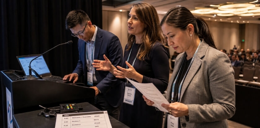
How you carry yourself and how you speak shape the audience’s confidence in your content as much as the content does. A strong deck delivered in a monotone, with eyes glued to notes, loses authority fast. Both skills can be coached with a little deliberate practice before the day.
Posture and Physical Presence
Your posture signals whether you own the room or are just passing through it. Stand with your feet roughly shoulder-width apart and your weight evenly distributed. Constantly shifting from foot to foot reads as nervous energy, even if you feel calm.
- Hold your ground at the front. Moving toward the audience occasionally builds connection, but pacing distracts. On a key point, plant your feet and let the words carry the weight.
- Use your hands deliberately. Open gestures, with palms facing outward or upward, signal openness and confidence. You do not need to choreograph every gesture, but be aware of what your hands do by default when you are nervous. Crossed arms, hands in pockets or gripping the lectern close you off visually.
- Face the audience, not the screen. Turning your back to read the slides breaks the connection. Skip the apology for nerves or unfinished slides too, since it only draws attention to them.
- Make real eye contact. Scan the room slowly, landing briefly on different people rather than sweeping past them like a lighthouse. In a large audience, pick a few anchor faces spread around the room and return to them periodically. It gives the impression of direct engagement even when you cannot meet everyone’s eyes.
Voice Modulation
Varying pitch, pace and volume keeps people listening, however good your slides are.
- Slow down more than feels natural. Nerves often make people speak too fast. If your pace feels slightly slow to you, it probably sounds right to the audience, especially when you introduce new terms or walk through complex data.
- Use pauses on purpose. A brief pause after a key finding or central argument gives the audience a moment to absorb it. Many speakers rush to fill silence because it feels awkward; resist that. A two-second pause after your main point works better than repeating it twice.
- Vary your volume. Dropping your voice slightly on an important detail draws people in; raising it signals significance.
- Watch your filler words. “Um,” “uh,” “like” and “so” multiply under stress. They are natural in conversation. A recording of a dry run is one of the most efficient ways to catch how often they appear; once you hear them, you will notice them in real time and can substitute a pause.
Body language and voice are tools for clarity, not performance tricks. Slowing down on key points signals importance, and eye contact with different parts of the room connects you with the whole audience, not just the front row.
How to Handle the Q&A Session Like a Pro
Handle Q&A by preparing for hard questions in advance, listening to the whole question, answering directly in a sentence or two, and admitting it when you do not know. The Q&A session feels like the most unpredictable part of a conference presentation, but a clear approach makes it manageable.
Prepare Before the Session Starts
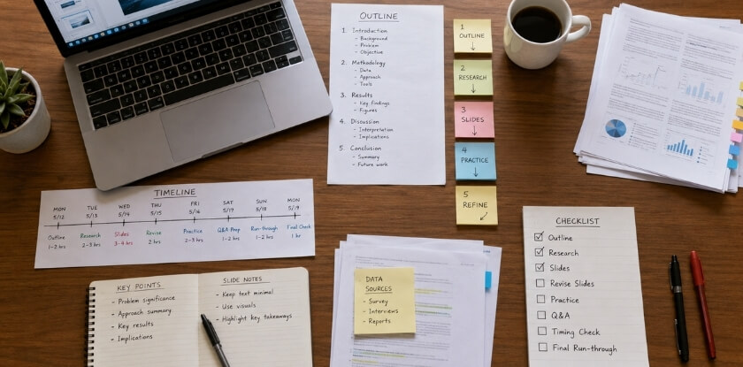
A presentation checklist built before the event, covering content, slide quality, technical setup, timing and rehearsal, is what separates a polished delivery from an improvised one.
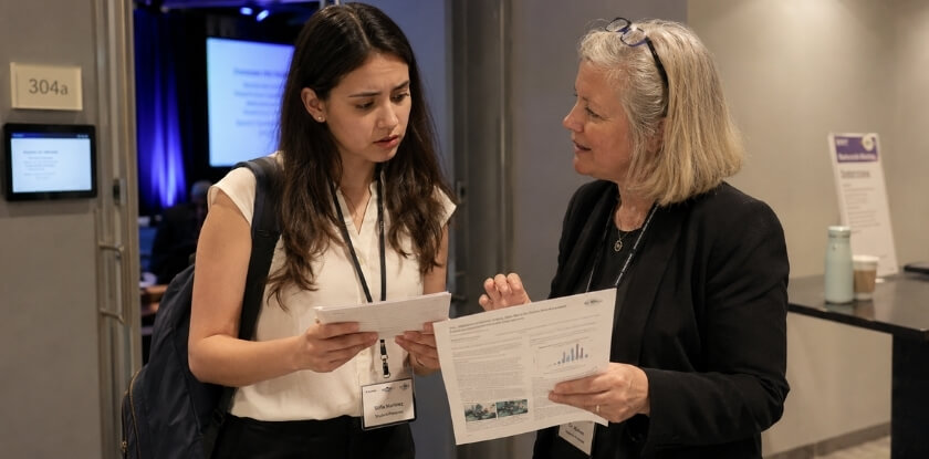
It is easy to spend all your time on what you will say and almost none on what you will be asked. Once your content is final, write down every question you would be nervous to hear, and ask a colleague to review your deck and do the same. Aim for a handful, roughly three to five. Questions often come from the gaps your time limit forced you to leave: methods, data, limitations, comparison with earlier studies, next steps and practical use. Slides you skipped over quickly are a good place to look. At an academic conference, expect probing of your methodology, data sources and conclusions. You do not need a scripted answer for each; a short mental framework for each tough area is enough. Those uncomfortable questions are exactly the ones you need to have ready, and a colleague who has not seen the work often spots weak points in minutes.
Listen to the Full Question Before Responding
- Do not interrupt or rush. Cutting someone off reads as defensive, and you may misread the question.
- Repeat or rephrase the question. In a large venue or a virtual conference, not everyone can hear the questioner. Restating it also gives you a moment to think, and turning to the whole room afterward keeps everyone engaged, not only the person who asked.
- Ask for clarification if needed. “Could you say more about what you mean by that?” is far better than answering the wrong question.
When You Don’t Know the Answer
This happens to everyone. “I don’t know, but that’s worth investigating” is honest and professional. Avoid guessing out loud and presenting speculation as fact, which can seriously undermine your credibility at an academic conference. You can also offer to follow up: take the person’s contact details or ask them to find you afterward.
Managing Difficult or Aggressive Questions
Sometimes a question is really a challenge or critique. Stay calm, keep your tone neutral, acknowledge the point briefly, give your response and move on. Do not get drawn into a back-and-forth debate in front of the room; invite the person to continue one-on-one afterward. If a question is off-topic, say “That’s a bit outside the scope of what I covered today, but I’d be happy to chat about it afterward.”
Time Management During Q&A
Know in advance how much time you have for questions. If your slot is ten minutes and someone gives a long preamble before the question, redirect gently: “I want to make sure I leave time for others. What’s your question?”
A Simple Structure for Answering Cleanly
Long, rambling answers weaken a Q&A. A reliable pattern: give a direct answer first, add one or two sentences of supporting context if needed, tie it back to your main contribution, then stop. A concise answer lands better than an exhaustive one that trails off. If the full answer needs more time than the session allows, say so and offer to share a resource, a follow-up email or a relevant slide after the talk. If nobody asks anything at first, you can break the silence yourself with a question the work naturally raises and answer it, or ask a colleague beforehand to have one ready.
Virtual Conference Q&A
A virtual Q&A needs more structure because the free-for-all of a room does not translate online. Decide in advance whether questions come through chat, the “raise hand” feature or a moderator, and tell your audience at the start. Designate a moderator if you can, since the chat fills up fast.
Pause a beat after each question to allow for lag, and read the question aloud before answering so people in other windows keep the context. If you field written questions, read a few before answering rather than responding to the first one that arrives, and group similar ones together. Keep your camera on and your eyes on the lens.
Special Tips for Online and Virtual Conference Presentations
Presenting online needs a different kind of preparation: your setup is part of your presentation, your slides must work on small screens, and you must build ways to see your audience. The screen creates distance between you and your listeners, and you have to account for it deliberately.
Your Setup Is Part of Your Presentation
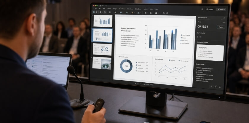
A bad audio feed or a flickering background undermines a well-built deck faster than any content problem.
- Camera position. Place the camera at eye level. Looking down into a laptop camera makes you look closed off. A stack of books or a stand works fine.
- Look at the lens. Your instinct is to watch the participant grid or your own video, which reads as looking away. When you make a main point, look straight into the camera.
- Lighting. Put the light source in front of you, such as a window you face or a lamp. A window behind you turns you into a silhouette.
- Audio. A USB microphone or decent headset makes a noticeable difference. A built-in laptop mic picks up every keyboard click and room echo.
- Background. Keep it neutral and uncluttered. If you use a virtual background, test it with your hair and clothing first, because some combinations cause flickering edges.
- Gestures. Fast movement looks jittery on compressed video, so keep hand movements slower and more deliberate.
Slide Design Needs to Adapt for Screens
Slides that look fine in a large hall can be cluttered on a laptop. The 5-5-5 guideline applies with even more force online, because viewers on small screens will not lean in to read dense text. Increase your font size slightly, choose high-contrast colors, and use the presentation or slideshow mode of PowerPoint, Canva or Prezi when you share, not the editing window. Reduce the text on each slide, since screen resolution varies across devices.
Managing the Audience You Can’t See
In a physical room you read the crowd. Online, that feedback (the confused looks, nodding heads and people checking their phones) disappears unless you build it in, so create small moments where the audience has to respond.
- Poll the audience early. Many platforms, such as Zoom and Teams, have a polling feature, though names and menus may change. A quick question in the first few minutes pulls people in.
- Use the chat actively. Ask a direct question mid-talk and acknowledge a few answers out loud.
- Pace yourself more slowly. Online listeners are also managing notifications, other windows and household noise. Virtual audio tends to flatten dynamics, so use more deliberate variation in pace and emphasis than you would in person; monotone delivery is even more deadening through speakers. You also cannot see whether people are leaning in or checking their phones, so check in with the audience periodically if the format allows it. Leave a beat of silence after key points.
Technical Rehearsal Is Non-Negotiable
Run a full technical rehearsal at least 48 hours before your talk. Test your audio and camera in the exact software the event uses, such as Zoom or Teams, or whatever the organizer specifies. Test screen sharing with the exact file you will use, check audio levels in the software the event uses, and practise switching between camera view and slides. A wired ethernet connection is more reliable than wifi for a live talk. Close every browser tab and background application, because notifications popping up on a shared screen are a common distraction, have your slides open and ready to share before the session starts, and decide beforehand whether you will share your full screen or only the presentation window. If the platform is new to you, explore it before the day.
Write down a backup plan: the organizer’s phone number, a second device you can log in from, and your slides in cloud storage. Technical problems can strike any virtual talk, and the presenters who handle them calmly are the ones who prepared for it.
Time Zone and Audience Analysis
If your talk reaches an international audience, check the time zone math. In winter, a 10 AM slot in New York is 3 PM in London and 11 PM in Singapore. In summer London stays at 3 PM while Singapore drops to 10 PM, and attention varies a lot across those hours. If the timing is difficult for part of your audience, acknowledge it briefly at the start, in about five seconds. It lands well with viewers who set an alarm or stayed up late to attend.
Make Your Presentation Accessible
An accessible talk uses high-contrast slides with brief text, describes visuals aloud, and reaches attendees before the session. The points below follow the Accessible Presentation Guide from SIGACCESS, the ACM special interest group on accessibility. They help people who are blind, have low vision, are colour-blind or are deaf or hard of hearing, and they make any talk easier to follow.
Slides
- High-contrast colours. Choose a scheme that works in dim and bright rooms and for colour-blind viewers. Do not rely on colour alone: add bold, italic or underline to show emphasis.
- Brief text in large sans-serif fonts, with simple graphics. Give a text equivalent for any graphic that carries information; purely decorative ones do not need it.
- Avoid animations unless you can give a detailed audio description. Caption videos and describe them aloud.
- Send your slides in advance, the previous day at the latest and ideally a week before, so attendees can open them on their own devices.
Speaking
- Describe images aloud instead of pointing at them, and avoid a laser pointer.
- Speak clearly at a steady pace, which also helps interpreters, and face the audience so people can hear you and, where relevant, lip-read.
- Use plain terms, without slang or colloquial phrases that do not translate well.
Conference Presentation Checklist
A checklist will not replace preparation, but it stops you from walking on stage having forgotten something obvious. Use it three times: before you finalize your slides, the day before, and on the day itself. It lists only the items that the steps above do not already spell out.
Before You Build Your Slides
Run through these before you open PowerPoint, Canva or Prezi, because getting the foundation right saves redesigning later.
- Presentation format chosen. Academic or professional? The expectations for depth, citation and tone differ significantly.
- Core message defined. You can state your main point in one sentence. If you cannot, the content structure is not ready yet.
- Time limit confirmed. You know your exact slot, including whether Q&A is inside or outside it.
- The five planning prompts reviewed. Check that each one has had real thought, not lip service.
Slide Deck Review
Once your slides are built, go through this before you call them final.
- No slide carries more than one main idea. If you are explaining two things on one slide, split it.
- All charts and visuals are labeled clearly, with axis labels and a source. An unlabeled graph is a liability in a Q&A session.
- Presenter notes are reminders, not a script. Full sentences in the notes panel encourage reading instead of speaking.
- Slides sent in advance if the organizers allow it. The accessibility section above gives the timing.
- File saved in multiple formats. A .pptx and a PDF backup, plus cloud storage and a USB copy for an in-person event.
Content and Structure Check
Do not rush this part. Read your content structure again with fresh eyes.
- Opening is strong. You are not starting with “Good morning, my name is…” and three slides of background.
- Key data points are verified. Every statistic, quote and reference is accurate and sourced.
- Transitions are clear. Someone listening, not reading the deck, can follow where you are going.
- Conclusion has a clear takeaway. The audience should leave knowing what to do, think or remember. Vague endings lose the room.
- Time has been tested. You ran the full talk out loud and timed it. Silent reading runs short; real delivery with pauses runs longer.
Delivery Preparation
- Body language practiced standing up. Posture, hand placement and eye contact all shift when you are on your feet rather than at a desk.
- Voice recorded once. Flat delivery is almost impossible to catch in your own head without a recording.
- Technical run-through completed. You tested the clicker, the microphone (if there is one) and the screen resolution.
- Backup plan exists. If the projector fails, you know whether you can present from a printed copy or talk through your points without slides.
Virtual Conference Setup
For an online talk, run the setup list from the previous section once more: eye-level camera, clean background, light in front of you, a microphone tested with recording software, a stable wired connection, and the screen share confirmed so the deck fills the screen properly. Also export the slides as a file in case the platform asks you to upload rather than share your screen.
Day-Of Checklist
These are the things that fall through the cracks when you are rushing.
- Arrive or log in early, 20 to 30 minutes at minimum.
- Confirm your speaker order and time slot with the organizer.
- Keep water within reach. A dry mouth mid-talk is a real problem.
- Put your phone on silent and out of your hand.
- The night before: file saved and backed up, slide fonts embedded, timer set, notes printed if you use them, and the tech tested. These small items are easy to forget in the pre-presentation rush.
- Set your Q&A plan: how long it runs, the likely questions, and a polite way to redirect anything you cannot answer.
Print this checklist and use it physically. Scanning a list in your head the night before is not the same thing.
From our experience at MS International: Our conferences are held in person only, so the room-based advice here is the part that applies most directly to our events; the online section is for other events you may attend. Papers are reviewed double-blind, and most review decisions are returned within about 10 working days, so build your slides from the version of your work that was accepted rather than a later draft. Accepted papers that are presented in person may be considered for the conference proceedings where applicable, with final publication subject to peer review, formatting and copyright requirements. Presentation lengths may vary, so your speaker confirmation and the final conference programme are the official sources for your room, speaking time and presentation order. Bring a backup copy of your slides on a USB drive, in the requested format, and test fonts, videos, audio and links before you present.
FAQ
Preparing a talk brings rules of thumb like 5-5-5 and the 5 P’s, slides for 15 minutes, PowerPoint, Canva or Prezi, rehearsal time, overrunning and getting ready for Q&A.
How long should a conference presentation be?
Conference talks commonly run 10 to 20 minutes, and the organizers’ guidelines set the exact limit. Check whether Q&A is inside the slot; one university guide suggests about 5 minutes of questions in a 20-minute talk. Professional events may allow longer sessions.
How many slides should a 15-minute conference presentation have?
Roughly 8 to 15 slides, based on about 1 to 2 minutes per slide. Data-heavy slides need more time each, so use fewer of them. Time a full run-through out loud, then cut slides until you finish with a buffer.
What is the 5-5-5 Rule for Presentations?
The 5-5-5 Rule limits slides to five words per line, five lines per slide and five text-heavy slides in a row. It is a guideline, not a strict formula, but it keeps your deck readable and your audience focused on you rather than the screen.
What are the 5 P’s of Presentation?
There is no single official list. One university course page uses Plan, Prepare, Practice, Preview and Present, while this article uses its own set: Purpose, People, Place, Process and Presence. They share one idea: delivery and readiness matter as much as technical content.
Which tool is best for building conference slides: PowerPoint, Canva or Prezi?
PowerPoint is the safest choice where compatibility matters, such as academic conferences. Canva suits professional events where visual polish is a priority, and Prezi suits non-linear, zooming stories. All three work; pick the one that fits the venue’s tech setup and your comfort.
How do I handle nerves before presenting?
Arrive early, run through your opening two or three minutes out loud, and take a few slow, deliberate breaths before you go up. Familiarity with your material does more for nerves than any other technique.
How much should I practice my conference presentation?
Practice until you can deliver it without reading your slides, and at least three timed run-throughs out loud. Extra runs are worth it for a talk that matters. Practice out loud, not just in your head.
Is it okay to read from notes during a conference presentation?
Occasional glances at notes are fine, but reading the whole talk word for word disconnects you from the audience. Brief bullet-point notes work better than full scripts.
What should I do if I go over time?
Skip straight to your conclusion. Rushing through the remaining slides is worse than cutting them, and a clean early finish beats an abrupt stop when the moderator signals you.
How should I prepare for the Q&A session?
Write down three to five questions you would rather not get and work out short, honest answers. If you do not know something, say so directly; “I don’t have data on that” beats guessing in front of an audience.
Do virtual conference presentations need different preparation?
Yes. Check your audio, camera and screen share at least a day ahead, ideally 48 hours before. Put less text on each slide because screens vary, look at the camera lens, and leave a beat of silence after key points.
Conclusion
Preparing a strong conference presentation takes real work, but none of it is mysterious. Fix your audience and time slot first, build around one core message, keep slides light, rehearse out loud against a timer, and plan for the questions you dread.
The speakers who do this well are not naturally gifted; they are prepared. Know your material well enough to talk around your slides rather than read them.