
You spent weeks refining your figures, adjusting your colour scheme and getting every label right. Then the poster session starts, attendees file past, and nobody has told you what to actually do. Where do you stand? Do you approach people or wait? What do you say in the first ten seconds? This guide covers only what happens once you are at your poster board: the preparation, the spoken delivery, the conversations and the follow-up.
Quick answer: To present a poster at a conference, prepare a two to three minute spoken summary, stand beside your poster so it stays visible, greet visitors with a one-line opener, and adjust your depth to each person’s background. Bring a handout or contact card, and send a short follow-up email within about 48 hours to anyone you spoke with.
How to Present a Poster at a Conference
A poster session is a series of short, repeated conversations, not a fixed talk. Visitors arrive at different times and know different amounts about your work, so you need a clear poster, a practised spoken summary and the ability to read each person and adjust.
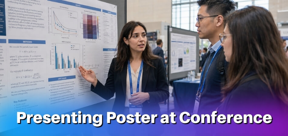
The table shows the whole session at a glance. Each stage is explained in its own section below.
| Stage | What to do |
|---|---|
| Before | Write and rehearse a 2-minute summary, print handouts and contact cards, plan your outfit, arrive early |
| During | Open with one line, tailor depth to the visitor, point at figures, ask for feedback, note questions |
| After | Organise your contacts, email within 48 hours, act on the feedback, decide the next step |
| Online | Simplify the layout, record a short video, watch the chat, follow up the same day |
Before the Session: What to Prepare (Beyond the Poster Itself)
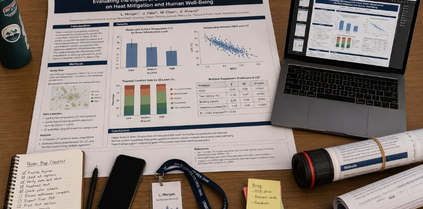
Start with the organisers’ instructions, then prepare three things: a two-minute spoken summary, something printed for people to take away, and an outfit that suits the event. Preparation takes the edge off poster nerves when someone asks a hard question. The poster handles the visual side, but you carry the conversation.
Check the Organisers’ Poster Instructions First
Your conference’s own poster instructions override any general advice. Before you travel, find your board number and session time, the poster size and orientation allowed, how posters are mounted, who supplies tape or clips, and when posters must come down. Some events also ask you to stand at your poster only during your assigned slot, so confirm that too.
Write a 2-Minute Verbal Summary
Your poster shows the work. The spoken summary explains why it matters and invites a real conversation.
Aim for roughly 120 to 150 words, delivered in about two minutes. Cover the problem, your method in a sentence or two, the key findings and one clear takeaway. That structure works for preliminary research and finished studies alike.
Practise it out loud several times, ideally in front of someone outside your field. If they can follow the logic, most attendees will too. It is a conversation, not a scripted oral talk, so let the wording vary each time. What you are building is a pitch you know well enough to start at any point, depending on how much the other person already knows.
Prepare Printed Abstracts and Contact Cards
Attendees may visit many posters in one session, so give them something that lets them reconnect with your research afterwards.
- A one-page handout. Include your title, a brief abstract, a simplified version of your key results and your contact details. Keep the formatting clean. This is a reference sheet, not a second poster.
- A contact card. Name, institution, email address and, optionally, a QR code or link to your full paper or preprint. Handing someone a card takes three seconds, while spelling out an email address takes longer and is easy to get wrong.
- A small kit. A pen and notepad for questions you cannot answer on the spot, tape or clips if the organisers do not supply them, and water, since you will be talking for a long stretch.
- The online equivalent. For a virtual poster, a short PDF shared by link, or a QR code on the digital poster, does the job of the physical handout.
What to Wear to a Poster Presentation
Business casual is appropriate at most academic conferences: clean, neat and nothing that draws attention away from your work. If the event is formal or the audience is high-profile, lean toward smart professional dress. At a small, discipline-specific event with a relaxed culture, a step below business attire is fine. If you are unsure, check the conference culture, look at photos from the previous edition or ask the organisers, and err toward slightly formal. Wear comfortable shoes, because you will be on your feet for the whole session.
Early-stage work does not lower the standard. The way you carry yourself at the board shows whether you take your own research seriously.
During the Session: How to Engage Viewers
Arrive early, open every conversation with one line, match your depth to the person, and treat questions as feedback. A simple poster backed by a confident, approachable presenter attracts far more attention than a polished poster with a presenter who looks away.
Arrive Early and Set Up Your Space
Getting to the board early gives you control. Find your assigned spot, confirm the poster is mounted properly, and arrange handouts and contact cards before the room fills.
Step back and look at the poster from five or six feet away, roughly the distance from which a passing attendee first sees it. If anything looks cluttered or hard to read from there, you will know before anyone arrives. Keep your materials within reach, for example stacked at a corner of the board or on a small table nearby, so you are not searching a bag mid-conversation.
Where to Stand
Stand to one side of the board, not in front of it, so visitors can see the content instead of your back. Make brief eye contact with people passing and invite them over rather than waiting passively. Keep your hands out of your pockets, keep your arms uncrossed and point to the figure you are discussing. Stay near the poster during peak hours, because walking off for coffee while the session is busy means missing the conversations you came for. If you need a break, ask a colleague to cover for a few minutes, or put your email address on the poster so visitors can reach you.
How to Open a Conversation With Passersby
Most people walking through are scanning. They stop only if something catches their eye or someone acknowledges them, so a small verbal cue from you changes the dynamic. A simple, direct opener works better than anything rehearsed:
“I’m looking at how [one-sentence research topic]. Happy to walk you through it if you’re interested.”
It tells them what they are looking at and gives them an easy yes. A presenter who freezes and waits for the visitor to speak first may get only a half-glance and a polite nod.
You do not need to launch into the full pitch at once. If someone leans in to read, give them a moment and then offer the walkthrough. If they are clearly in a hurry, a one-sentence summary and a handout are often the right call. If someone arrives while you are mid-conversation, acknowledge them with a nod or a quick “I’ll be with you in a moment”. Left standing unseen for five minutes, they will leave.
Tailor Your Explanation to the Audience’s Background
A poster hall draws a mixed crowd: specialists, researchers from adjacent areas, graduate students and sometimes practitioners or journalists. An explanation that suits one group will confuse or bore another, so calibrate with a quick question such as “Are you working in this area, or coming at it from a different angle?” Their answer, or cues from their badge, tells you what to adjust.
- Specialists: skip the foundations and go to what is new, meaning your method, your findings and the gap you address.
- Adjacent fields: add a sentence or two on why the question matters before the details land.
- Non-specialists: use plain language and concrete outcomes. What changes if this holds up?
Adjusting does not mean dumbing down. It means choosing which parts of the story to stress for each listener.
How to Tell a Story Through Your Poster
Treat the poster as a short conversation with a beginning, middle and end, not a paper reading or a lecture. Use the poster as a visual aid, not a script: point to the figure or data as you mention it, and if someone is already reading a section, let them finish and then build on what they have seen. Do not read the poster aloud. Attendees can read, and reciting the text signals that you prepared no real presentation.
- Start with the problem. What prompted the research and why does it matter? Context pulls people in faster than methods.
- Move through the work. What you did, what you found and what it means. The poster holds the detail. You give it a spine.
- End with an open door. “We’re still working through the implications for X” or “the finding that surprised us most was Y” invites a question instead of closing the exchange.
Do not paste your whole paper onto the poster either. Dense walls of text push viewers away, and the detail belongs in the conversation, the handout or the paper itself. Lead with what you found and keep caveats for the conversation that follows. Hedging so much that the main finding disappears weakens the pitch. Keep the walkthrough to about two to three minutes unless the person signals they want more.
How to Handle Questions and Get Feedback
If you cannot answer a question, say so directly and offer to follow up by email. “That’s outside the scope of this study, but we’re thinking about it for the next phase” is a credible answer. Faking certainty damages credibility fast. Treat a challenge or skeptical question as a gift. Pointed questions show genuine interest: the informal setting means people will ask things they would never raise in a lecture hall.
Most people will not volunteer criticism unless you ask. After your walkthrough, try a concrete question: “Does the framing of the research question make sense the way I’ve presented it?” or “Is anything in the methods unclear?” Specific questions get specific answers, while “What do you think?” gets polite nodding. To check that you are being clear, ask “Have I explained that clearly enough?” or “Should I go into more detail?” rather than “Do you understand?”
Write down any challenge or suggestion right after the conversation, on your phone or on the back of a handout. You will not remember the exact wording by the end of the session. A quick note after each substantive chat is enough, with no formal form needed.
Keep an eye on who is lingering. Some attendees want a full walkthrough, others just want your handout. If someone wants a long discussion, suggest a coffee or a follow-up chat so other visitors are not kept waiting, and thank each person for stopping by.
After the Session: Follow-Up and Next Steps
Send a short, specific follow-up email within 48 hours to anyone you had a real conversation with. What you do in the two days after a poster session often decides whether the connections lead anywhere.

Collect and Organise Your Contacts
Before you leave the venue, keep the cards you received together with the ones you handed out, and do not let context disappear if someone wrote a note on the back of theirs.
- Write notes immediately. Memory fades fast in a busy conference hall. Next to each name, jot what they asked, what they were working on and why the conversation stood out. A name alone will not help you write a specific email two days later.
- Separate warm contacts from casual ones. Some attendees were genuinely excited about your findings and others were passing through. Spend your follow-up time accordingly.
Send Follow-Up Emails Within 48 Hours
Reference something concrete from the conversation, such as a methodology question or their own project. A message like the one below does more than a generic “nice to connect”:
“It was great meeting you at the poster session. I wanted to share the link to our preprint, as promised.”
Networking built at conferences goes cold quickly without follow-up. Keep it short. Attach the abstract or a PDF of the poster if useful, and if you discussed a collaboration, name a next step plainly. For people you met in an online session, follow up through email or LinkedIn within a couple of days.
Act on the Feedback You Received
Feedback from live questions is useful even when it is uncomfortable, and peer feedback in an informal setting is often more candid than a formal review. Look for patterns, not just single comments. If three people asked about your sample size, your framing of the preliminary research has a gap to fix before the next conference or before submission. Critical questions you recorded often become the basis of a stronger discussion section in a future paper, or they expose assumptions worth addressing directly.
Think About What Comes Next for the Research
A poster is often a checkpoint, not an endpoint. Use the audience response to judge interest and adjust direction before the next phase. Consider whether the work is ready for an oral presentation at a future event or for a journal submission now that you have tested how it lands with a live audience. Distilling the argument for a poster also makes drafting a full manuscript easier. If one finding drew a strong reaction, give it more prominence in any written version. Audience engagement tells you which parts of your work resonate, which peer review cannot.
How to Present a Poster at a Virtual or Online Conference
For an online poster, simplify the layout, record a short video, open with one strong sentence and watch the chat. The adjustment is not purely technical: attracting attention, explaining your work and holding a conversation all work differently on screen. The format changes but the standards do not: you still need a prepared summary, a way to share contact details and real engagement with whoever shows up.
What’s Actually Different
Online sessions vary by platform. Some conferences use spatial environments such as Gather.town where attendees walk an avatar up to your poster. Others use Zoom breakout rooms, pre-recorded video, or platforms such as iPoster or F1000 where attendees browse and comment asynchronously. Find out which format you have, because preparing for a live room differs considerably from preparing for an async platform where visitors arrive on their own schedule.
The passive foot traffic of a physical hall does not exist online. Attendees must actively click into your space, and many will not without a reason.
Preparing Your Virtual Poster
- Optimise for screen reading. A poster designed for print at 48 by 36 inches often looks cluttered on a laptop. Simplify the layout, increase font sizes and cut the text per panel, because viewers cannot lean in to read small type.
- Record a short video walkthrough. Platforms usually allow or encourage a recorded summary, typically 2 to 5 minutes, so check the limit for your event. Cover why you did the research, what you found and why it matters, speaking to the camera and not reading the slides. This recording is often what decides whether someone stays to chat live.
- Write an abstract that stands alone. On many platforms attendees read your description before clicking in. Make it communicate your core findings in plain language without assuming they have seen the poster.
- Put contact details on the poster. Online attendees cannot pick up a handout, so your email and any links belong on the slide or PDF itself.
Engaging Attendees During a Live Virtual Session
Treat the first 30 seconds as the moment people decide whether to stay.
- Open with one strong sentence instead of “Hi, welcome.” For example:
“This study looked at why treatment dropout rates are higher in rural clinics, and we found a pattern that wasn’t in the literature before.”
That gives the attendee something to respond to.
- Ask questions early. Ask about their own work within the first minute. It turns a presentation into a conversation, which is more interesting for them and more useful for your networking.
- Keep the summary tight. A 90-second summary works better online than a five-minute walkthrough, since people are often multitasking or moving between rooms. If they want more, they will ask.
Handling Q&A and Chat
Watch the public chat. Attendees too hesitant to speak will often type a question, and ignoring the chat means missing questions that never get spoken. In a breakout room with several visitors, take one question at a time and direct your answer to the whole group, not just the person who asked.
Follow-Up and Async Sessions
Follow-up is easier online because you probably already have names from the platform, and many conferences have a messaging feature. If someone had a substantive conversation with you, message them the same day and attach a PDF of the poster or a link to your preliminary research if it is public. If there is no messaging, a digital contact card shared in the chat or comments serves the same purpose, with your email and a link to your academic or institutional page.
Some conferences schedule no live session at all, and your poster stays on the platform for days or weeks while visitors comment. In that format, check the platform regularly and answer quickly, since a question left unanswered for three days can make the space look inactive. If the platform allows it, post a discussion prompt yourself, such as “Happy to discuss the methodology. What questions do you have?”
How to Present Preliminary or Developing Research as a Poster
State clearly where your research stands, and offer your questions and design instead of conclusions. Conferences often welcome work in progress, and audiences handle uncertainty well. What they cannot handle is a presenter who oversells half-finished findings or buries the “in progress” status.

Be Honest About Where You Are
Say your stage in the verbal summary: “We’re about six months into data collection, and I’m here to share what we’re seeing so far and get some early input.” That sets expectations and usually invites better conversations than a presentation that sounds more definitive than it is. Your abstract and handout should reflect it too. Do not write them as if you had results you do not yet have.
Shift the Focus to Your Questions
With developing research, your most valuable offer is not answers but well-formed questions. A clearly stated research question, a solid framework and a thoughtful method are often more interesting to other researchers than a table of early numbers.
- Lead with the problem you are solving. Spend the first part of your pitch on why the question matters, not on hedging about data.
- Show your design choices. If data collection is ongoing, walk visitors through the method. Experienced researchers often have strong opinions, and it is better to hear them before you are locked in.
- Frame early data as directional. “Initial results suggest…” or “We’re seeing a pattern that seems to indicate…” is accurate and still engaging.
Use the Q&A as a Working Session
Treat questions less like a defence and more like a structured conversation with people who know the field. Keep a small notebook or your phone handy for suggestions, methodological concerns and references people mention. A comment from a seasoned researcher can change how you approach the next phase. If you cannot answer yet, say so: “That’s something we’ll know more about after the next data collection phase” is a perfectly acceptable answer.
Networking Matters More at This Stage
Your connections can shape where a preliminary project goes. Hand out your contact card freely without waiting to be asked, and tell people who show interest that you would welcome their input as the project develops. A follow-up that names the specific conversation and what you took from their feedback is a concrete next step, and networking built around a shared research question tends to last longer than general introductions. You are also allowed to be enthusiastic about an unfinished project. Genuine interest in your own question is more compelling than a polished but flat presentation of complete findings.
Poster Presentation vs. Oral Presentation: Key Differences
A poster session is a set of repeated, flexible conversations, while an oral presentation is one fixed talk to a seated room. They differ in more than length, and each asks something different of you.
| Feature | Poster session | Oral presentation |
|---|---|---|
| Audience | Mixed, wandering, stays 30 seconds to 15 minutes | Seated, committed for the full slot |
| Structure | Non-linear, guided by the visitor’s questions | Linear: introduction, methods, findings |
| Q&A | Extended, one-on-one or small groups, throughout | At the end, public, often brief |
| Materials | Handout, printed abstract, contact card | Slides; rarely anything handed out |
| Depth | Clarity and brevity; detail only when asked | Can go deep for a specialist audience |
| Networking | Conversational; easy to follow up | Reaches many people quickly, fewer direct chats |
Audience Flow and Attention
In an oral presentation you control the room: everyone faces the front and you set the pace. At a poster session you have no guaranteed attention span. Some people give you thirty seconds, others fifteen minutes, and you have to earn that attention repeatedly, with different people, across the whole session.
How You Communicate
An oral talk follows a fixed sequence. A poster viewer might read your results before your methods, or ask a question before you have said a word. You therefore need a flexible summary that is closer to a conversation than a lecture. Your pitch starts the exchange, but what the other person wants to know guides the rest. Materials matter more too, because a handout or contact card lets the conversation continue after you both move on.
Depth, Feedback and Networking
Specialised symposia can go deep because the audience signed up for the topic. At a poster hall the audience is mixed, so lead with your main finding and save methodological depth for those who ask.
The informal setting also invites candid input you rarely get from a roomful of strangers watching a formal talk, which is why posters suit preliminary work. And although a well-placed oral presentation can reach many people quickly, networking can work better at posters. You are talking with people, not at them, and introductions to a visitor’s colleague happen naturally. Neither format is superior. They suit different stages of research, audiences and goals.
Is Presenting a Poster at a Conference Worth It?
Yes, if you treat it as an active part of your research communication, not a passive display. A poster can feel like the consolation prize for missing an oral slot, but that undersells what the format offers.
What You Gain That an Oral Presentation Doesn’t
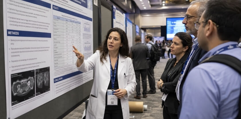
- Direct, sustained conversation. Visitors chose to stop, so you get the back-and-forth that sharpens your thinking and sometimes starts collaborations.
- Repeated practice with your material. You may give your summary five, ten or twenty times. By the end you know which parts confuse people, which findings interest them and where the argument has gaps.
- Lower-stakes networking. Conversations start naturally, without the formality of a panel. Exchanging a card with someone who walked up because your title caught their eye is a warmer introduction than a cold email after an oral session. The follow-up also lands better, because the other person remembers seeing your findings and asking you something.
- Visibility for work in progress. Preliminary work often does not fit an oral slot but suits a poster, and feedback is most useful before the work is finished.
When It Might Feel Less Valuable
If the conference is a poor fit for your topic, foot traffic will be thin. Some large conferences schedule posters at awkward times, such as just before the closing reception or opposite a keynote everyone wants to see. You cannot control that, but you can study the schedule in advance. Posters also reward preparation. A session goes flat when you arrive with only the printed poster, no handout and no pitch. If you can hand something over and shift your explanation between a specialist and a curious outsider, you get far more out of it.
Dos and Don’ts of Poster Presentation
These habits can make or break a session, from departmental gatherings to large international meetings. Each one is explained in the sections above, so use this as a last check before you walk into the hall.
| Do | Don’t |
|---|---|
| Have a 90-second to two-minute overview ready before anyone asks | Stay silent while you wait for visitors to finish reading |
| Leave something physical behind, because attendees rarely remember your board number | Rely on people searching for you later |
| Stay near the poster at peak hours | Walk off for coffee while the session is busy |
| Welcome uncomfortable questions and offer an email follow-up | Bluff an answer |
| Dress for the formality of the event | Assume casual clothes are fine at a major international meeting |
| Rehearse the pitch on someone outside your field | Stumble through it for the first time with a real visitor |
| Prepare an online session as carefully as an in-person one | Treat a virtual poster as a lower-effort format |
FAQ
Standing by your poster for a whole session raises practical points about a memorized script, the length of your verbal summary, attire, what to bring and following up with visitors afterward.
Do I need to memorize a script for my poster presentation?
No. Learn your key points and a strong opening line, not every word. A loose two to three minute summary sounds more natural than a recited script, and you will repeat it many times.
How long should my verbal summary be?
Two to three minutes for a spontaneous visitor. Keep a longer four to five minute version ready for someone who asks detailed questions, and match your depth to how engaged the person seems.
What should I bring besides the printed poster?
A printed abstract or handout, contact cards, a pen and a small notepad for questions you cannot answer on the spot. Add tape or clips if the organisers do not supply them, and wear comfortable shoes.
Is professional attire required for a poster session?
Follow the conference’s dress code. Poster sessions are less formal than oral presentations, but business casual or smart professional dress suits most academic conferences.
Can I present a poster if my research isn’t finished?
Yes. Poster sessions are a common venue for preliminary and developing research. Say clearly where you are in the process and frame findings as early-stage or in-progress.
How do I handle a question I can’t answer?
Say you do not know, write the question down and offer to follow up by email. Conference attendees respect honesty far more than a guessed answer.
What’s the difference between a poster session and a Q&A at an oral presentation?
Poster conversations are one-on-one or in small groups and move at your pace, while a Q&A after a talk is public and time-limited. The poster format allows a longer back-and-forth on one person’s specific questions.
How do I stand near my poster?
Beside it, not in front of it. That keeps the content visible, and a nod or a smile welcomes people in.
Do I need a separate handout for a virtual conference?
Usually a downloadable PDF of your poster does the same job. You can also share a one-page summary in the chat or via a link during the session.
Do I have to stay at my poster for the whole session?
Stay for your assigned session time unless the conference instructions say otherwise. If you must step away briefly, put your email on the poster or ask a colleague to cover.
Should I send a follow-up email to everyone I spoke with?
Send one to anyone who gave you a card or showed real interest in your findings. A brief message that mentions your conversation is enough, with no lengthy pitch.
Final Thoughts
Your poster gets people to stop, and what you say next makes the visit worth their time. Prepare a short summary, bring something to hand over, and show up ready to talk about your work with real interest.
From our experience at MS International: our conferences are held in person only, so the virtual advice above applies to other events you may attend. Accepted authors complete author registration, and the check-in time is stated in your confirmation email, so confirm the format and any size limit with the organisers before you print anything. Papers presented in person may be considered for proceedings where applicable, but a poster or presentation slot does not by itself guarantee publication.