
Your research is finished and the paper is written, and now it has to fit on one sheet that people read while walking past. Most of the stress comes from not knowing where to begin. A clear order of steps removes much of it.
Quick answer: To make an academic conference poster, follow six steps: settle one key message, check the conference’s size and file rules, sketch a two- or three-column layout, write short sections, design with readable type and high contrast, then proofread and export a print-ready PDF. Most university guides ask for body text of 24 pt or larger and images of about 300 dpi at final size.
Last verified against official sources: October 2026.
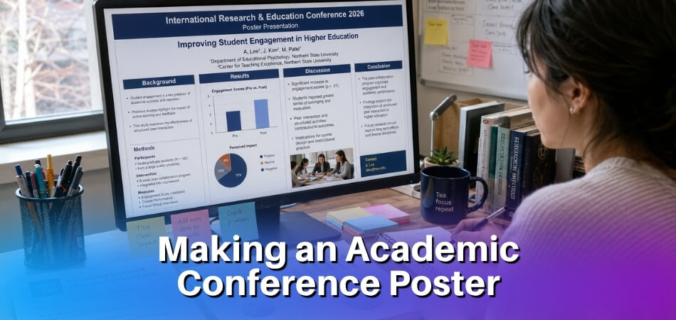
Three days before the conference, with a blank PowerPoint slide in front of you, it is easy to wonder where to start, what size to use and how to squeeze months of work into something a stranger can follow in a few seconds. Your poster is the public face of your research, and most people walking past decide whether to stop based on the title, one figure and the overall layout. A good poster is not a printout of your paper. It is a short visual argument that leads the reader from your research question to your key findings without clutter. The process below works in PowerPoint, Google Slides, Canva, Adobe Illustrator or Inkscape, and it does not need a design degree.
How Do You Make an Academic Conference Poster Step by Step?
Work through six steps in this order: key message, layout, content, design, build, then review and export. The sections below cover each step, and the table shows the typical specifications that many university guides and conferences use. Your own conference’s instructions always override it.
- Define your key message before you open any software.
- Sketch the layout on paper, with two or three columns.
- Write the content, short and in the right order.
- Design with two fonts, strong contrast and large figures.
- Build it in a tool, with the canvas set to the exact size first.
- Review, export and print from a PDF, after a proofreading pass.
| Item | Typical value | Note |
|---|---|---|
| Poster size | A0 (841 × 1189 mm, 33.1 × 46.8 in), 36 × 48 in, 48 × 36 in or 90 × 120 cm | Set by the conference |
| Orientation | Portrait or landscape | Some boards accept portrait only |
| Title | 72 pt or larger | Guides differ, so follow your conference |
| Section headings | 36 to 56 pt | Same weight throughout |
| Body text | At least 24 pt; 28 to 36 pt is common | Readable from 1 to 2 metres |
| Captions and acknowledgements | About 18 to 22 pt | Never smaller than 18 pt for anything meant to be read |
| Columns | Two or three | Equal widths |
| Image resolution | About 300 dpi at final size | Some printers accept less, so ask |
| File for print | PNG for online display |
What Is an Academic Conference Poster and Why Does It Matter?
An academic conference poster is a large printed display that summarises a research project for a live audience at a scholarly event. You stand next to it, people walk up, read it and ask questions.
It sounds simple, but the constraint is tough. A poster has to distil months or years of work into something a stranger can understand at a glance, and most researchers underestimate that until they watch people walk past their own poster.
What makes it different from a paper or a slide deck
A journal paper gives you thousands of words and expects a dense argument. A slide deck runs in sequence, controlled by the presenter. A poster does neither. It has to work visually, with no narration, and it still has to hold up when you are standing there talking about it.
That is why visual hierarchy matters so much. Attendees scan before they read: they look at the title, catch a figure, maybe read a caption. If the layout does not guide the eye, they leave. A well-built column layout creates a natural reading path without anyone having to think about it.
Why the format still matters in a digital age
Physical posters are still relevant even though PDFs and preprints exist. A poster session is one of the few places where you get direct, informal feedback from other researchers in your field. People ask questions they would never put in a peer review, and a couple of hours at your poster can produce conversations that shape your next paper. Treat the poster as a conversation starter and every design choice, from typography to colour, becomes a question of getting someone to stop walking and start talking.
Before You Begin: What You Need to Know
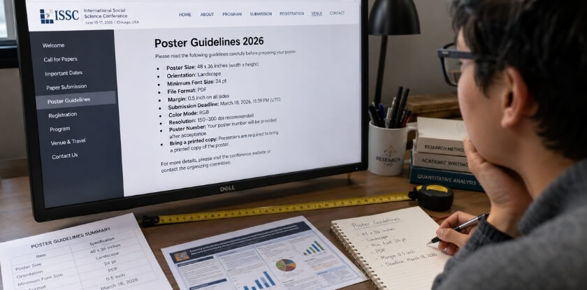
Read the conference’s poster instructions before you open any design tool. They set the size, orientation, file format and sometimes the layout, and they have the final say over any general advice, including this article.
What to look for in the instructions
Sizes vary more than you would expect. Standard sizes in North America are typically 36 × 48 inches (portrait) or 48 × 36 inches (landscape), while many European and international events use A0. Published rules differ: ISIR, for example, asks presenters to aim for about 84 × 119 cm. Some boards take portrait posters only, and a few conferences tell you exactly where to hang the poster and how much wall space you get. Printing a 48-inch-wide poster when the board fits only 36 inches is an expensive mistake, and resizing a finished poster shifts text boxes, distorts images and breaks your columns.
- Dimensions: width × height, in inches, centimetres or millimetres
- Orientation: portrait or landscape
- File format for submission: most print shops want a PDF, and some conferences collect posters digitally and may ask for PNG
- Print resolution: ask what your print provider needs
- Branding rules: some conferences require a specific logo bar or colour strip at the top
- Colour limits: a few venues print in greyscale only
Download the guidelines when you register, and check them again before you export. Organisers can refuse to print a poster that misses the size specification, and that usually happens too late to reprint. If a detail is vague or missing, email the organisers and ask for the exact dimensions. One line of email costs far less than discovering the problem at a print shop the night before the session.
From our experience at MS International: our conferences are held in person in the Greater Toronto Area, the check-in time is stated in your confirmation email, and presentation lengths may vary, so your speaker confirmation and the final conference programme are the official sources for timing. If your event instructions do not give poster dimensions, write to the conference team before you print.
Step 1: Define Your Research Question and Key Message
Start with the single most important thing you want someone to walk away knowing, and write it as one sentence before you open PowerPoint, Canva or anything else. This is where most posters go wrong: researchers try to fit an entire paper onto a few square metres of board, and nobody reads past the title.
Narrow it down to one takeaway
Your poster does not need your full literature review, every limitation or six sub-analyses. Take your research question and ask what you found and why someone at this conference should care. If you cannot state the answer in about 20 words, it is still too broad. For example:
Short mindfulness courses lowered anxiety scores in first-year medical students over eight weeks.
That is specific, and it gives a passerby a reason to stop. Your whole poster is built around it.
Write three sentences before you design anything
Grab a blank document or a piece of paper and write down:
- your research question (one sentence)
- your main finding or result (one sentence)
- why it matters to this specific audience (one sentence)
These three sentences are the skeleton of the poster. Methods, figures, acknowledgements and the affiliation block exist to support them, not compete with them. Visual hierarchy only works if you have already decided what sits at the top, and that decision happens here, not during design.
Match your message to the conference
Some conferences want completed research, others accept work in progress. Some fields expect a formal hypothesis-driven structure, while others are fine with descriptive or qualitative work. Check the guidelines before you finalise your framing so the message fits the room you are walking into.
Step 2: Sketch Your Layout (Poster Structure Plan)
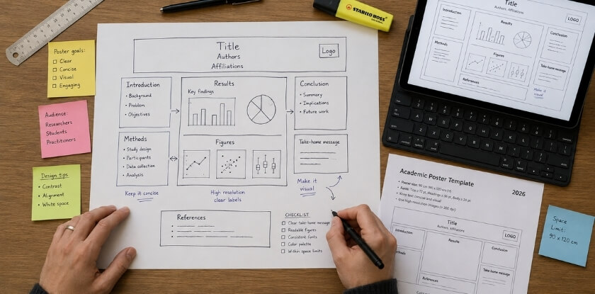
Draw the layout on paper before you open any tool. A rough pencil sketch takes five minutes and saves you from redesigning everything at 11 pm the night before the conference. Decide where the title, introduction, methods, results, conclusion, figures and affiliation sit before you touch a single pixel.
Which column layout should you choose?
Most academic posters use two or three columns. Four columns appear occasionally on very wide formats but are harder to pull off cleanly.
Two columns suit image-heavy work or results that need large figures, because wider columns give each visual room to breathe. They are good for A0 landscape. Three columns are the standard for most disciplines. Readers scan left to right and top to bottom, and three columns divide content neatly into introduction, methods and results, then discussion and conclusion. A0 portrait fits this structure well.
If the conference does not give a size, A0 portrait (841 × 1189 mm) with three columns is a safe default, since most printing services and many boards accommodate it. A few practical rules:
- Keep column widths equal. Unequal columns look accidental, not deliberate.
- Leave a gutter of at least 1 to 1.5 cm between columns, and keep text boxes out of it.
- Use the alignment and distribution tools in your software (guides help a lot in Illustrator and Inkscape), align the edges and keep the section blocks at similar heights. Mismatched widths and ragged block heights are the most common layout fault.
How does visual hierarchy work?
Visual hierarchy is the order in which a reader’s eye moves through the poster. You control it with size, weight, contrast and placement. Done well, someone standing two metres away can absorb your key message in under ten seconds. From most to least dominant:
- Title: the largest text on the poster, full width, high contrast
- Section headings: clearly larger than body text, same weight throughout
- Figures and graphs: these draw the eye before text does
- Body text: readable at arm’s length
- Captions, acknowledgements and affiliation details: smallest, but still legible
Whitespace is a design element. Blank space around a figure tells the reader that it matters, and cramming every centimetre with text destroys the hierarchy. If your sketch looks full before you have added any figures, cut content, not whitespace. Ruler guides and snap-to-grid settings exist for exactly this reason, and they let PowerPoint or Canva produce solid spacing if you stay disciplined.
Step 3: Write Your Content: What to Include and What to Leave Out
Give someone enough to want to talk to you, not enough to never need to. A poster is not a paper, so keep body text to a few hundred words in total. That sounds shockingly low, but it is what makes a poster readable at a glance. Published ranges run from a few hundred words to about 800, and some conferences set a hard limit of their own.
| Section | What it does | How to keep it short |
|---|---|---|
| Title | States the core message in one line | Specific beats clever; avoid abbreviations that are not standard in your field |
| Authors and affiliation | Names, institution, often an email or ORCID | Directly below the title, in the agreed author order |
| Introduction | Frames the gap and ends with your research question | One or two short paragraphs, no literature review |
| Methods | Approach, participants or data, key variables | Bullets, or a small flowchart for complex methods |
| Results | Your strongest finding first | Figures, charts and tables rather than paragraphs of numbers |
| Conclusion | What you found and what follows from it | Three to five sentences, with no hedging padding |
| References | Key sources only | Six to ten citations in a compact style |
| Acknowledgements | Funding, collaborators, dataset credits | Two or three lines |
| QR code (optional) | Links to the full paper, data or a project page | Place it near the conclusion or at the bottom |
Title, authors and affiliation
Your title is the first thing someone reads from three metres away. Keep it to one line if you can, and two at most. If a specialist cannot tell what the poster is about in five seconds, rewrite it. Below it, list all authors in the agreed order, with the institution name, department and sometimes a logo directly underneath. Many conferences specify where the logo sits, so check before you design. If you have a corresponding author, mark them with an asterisk and put the email at the bottom of the poster, not in the header block.
Introduction and background
Write a setup, not a literature review: here is the gap, here is why anyone should care, here is what we set out to do. Put your research question in its own sentence at the end so it does not get buried. Cut anything purely definitional, because if the people at this conference do not know a term, a poster is not the place to teach it.
Methods, results and conclusion
These three sections carry the science, so they need space, though not unlimited space. Lead the results with your strongest finding. Every figure needs a caption and every axis a label, so readers do not have to decode what they are looking at. In a three-column poster, a common flow puts methods on the left, results in the wide middle column and the conclusion on the right, which matches how most readers scan.
References and acknowledgements
Nobody reads a full reference list standing up with a coffee in hand, so show only the key sources, in a small font of around 16 to 18 pt. Funding bodies, grant numbers, ethics approval references and collaborators who did not make the author list belong in the acknowledgements. Some funders require specific wording, so check your grant terms. Add both sections early in the draft rather than at export time, when you are tired and errors creep in, and leaving them out can also breach funding requirements.
Step 4: Design Your Poster (Typography, Color, and Visuals)
Design is communication, not decoration. Choose two fonts, high-contrast colours and large figures, and test everything at print size.
Font size and typeface selection
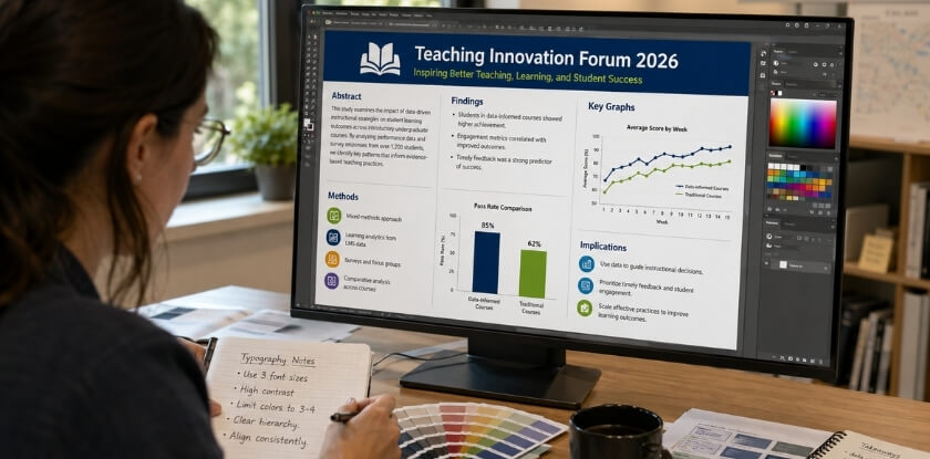
If someone cannot read your title from 1.5 metres away, it is too small. Use the sizes in the table at the top of this article as your starting point: 72 pt or larger for the title, 36 to 56 pt for headings and at least 24 pt for body text. Authors and affiliation can sit around 36 to 48 pt. University guides differ on exact numbers, so follow your conference or institution if it gives a rule.
Stick to two typefaces, one for headings and one for body text. Three or four fonts look chaotic and undermine your hierarchy before anyone reads a word. Sans-serif fonts such as Helvetica, Arial, Calibri or Lato stay clean at large sizes, and a contrasting serif such as Georgia can give the title some distinction. Leave out novelty fonts and decorative scripts, and avoid using more than three font sizes in the body blocks, or the hierarchy collapses into visual noise. Use bold for emphasis, not habit, because if everything is bold, nothing is.
Inkscape and Adobe Illustrator let you convert text to outlines before export, which prevents font substitution at the print shop. Keep an editable copy with live text.
Colour scheme and contrast
Pick three colours and defend them: a background, a primary accent for headings or section blocks, and a secondary accent for highlights or borders. Use your highest-contrast colour for the title and key figures and a neutral or muted background for body sections, so the important elements stand out. Many good posters use a white or very light background with one strong institutional colour from your university’s brand guidelines. Dark backgrounds can look striking on screen but create contrast problems in print, especially for body text, and neon backgrounds or dark-on-dark blocks make data invisible.
Black or very dark text on white is readable at every distance, while pale grey text on white is not. A free contrast checker such as the WebAIM tool will report the ratio, and WCAG accessibility guidance asks for at least 4.5:1 for normal text. Avoid using colour alone to carry meaning in charts, since some readers are colour blind, and pair colour differences with shape or pattern. Print a small test patch on the printer you will use, because screen and print colours differ and a rich colour on your monitor can print muddy.
Rules for using figures, charts and images
Every figure needs to earn its place. If it does not support your research question or key message, cut it.
Resolution is where people make expensive mistakes. For print, aim for about 300 dpi at the final poster dimensions. An image that looks sharp at 72 dpi on screen prints soft and pixelated at A0, and screenshots are usually 72 dpi, so converting them later does not help. Check resolution before you design around an image, not after. Charts pasted from Excel or Google Sheets often arrive at screen resolution, so recreate them natively or export them at high resolution as PNG or TIFF.
- Label axes directly. Legends make readers work harder than they need to.
- Remove chart junk such as unnecessary gridlines, 3D effects and shadows.
- Keep a consistent visual style across all figures, with matching palettes.
- Use original high-resolution source files for photographs and microscopy images, not screenshots or web downloads, and credit any image you did not create after checking its licence.
- Keep each figure readable from one metre away. If a chart needs squinting, enlarge it or replace it with a simpler summary.
- Caption every figure in one or two lines.
In a column layout, a figure normally sits within one column. Spanning two columns can work for particularly important data, but doing it for every image breaks the grid.
Step 5: Build Your Poster Using the Right Tool
Use PowerPoint or Google Slides unless you have a specific reason not to: they are predictable, your colleagues can open them and they produce print-ready PDFs when set up correctly. The tool matters less than getting the dimensions right from the start. Set the canvas size before you add anything, because changing it later causes rescaling headaches.
| Tool | Best for | Main limitation |
|---|---|---|
| PowerPoint | Most researchers; clean PDF export | Weak with vector graphics; custom size capped at 56 inches |
| Google Slides | Co-authors editing together | Fewer layout controls; image compression |
| Canva | Fast, clean layouts from templates | Print export options and template sizes need checking |
| Adobe Illustrator | Vector control, CMYK, bleeds | Learning curve and subscription cost |
| Inkscape | Free vector editing, native SVG | Clunkier interface; set export DPI manually |
Creating a poster in PowerPoint
PowerPoint is the default choice for most researchers: it is already on your computer and it exports to PDF cleanly. Go to Design → Slide Size → Custom Slide Size and enter the exact poster dimensions. Do not use a standard slide size and plan to scale it later.
PowerPoint caps custom slide size at 56 inches. If your poster is larger, enter half the dimensions and ask the print shop to print at 200%, which is a common workaround, though you should confirm that your printer handles it. Everything doubles, including text, so a 20 pt font prints at 40 pt.
For your columns, use View → Guides and drag guides to mark the column edges, so text boxes and figures line up. Use the title and body sizes from the table at the top as starting points. When you finish, use File → Save As → PDF and choose the high quality print option, and keep the editable .pptx as your working backup. If you paste charts from R or MATLAB, paste them as Enhanced Metafile (EMF) rather than bitmap to keep them crisp.
Creating a poster in Google Slides
Google Slides is usable for poster work, particularly if co-authors need to comment or edit in real time. It is less precise than PowerPoint for layout. Set your dimensions under File → Page Setup → Custom first, in centimetres or inches. Alignment tools are limited, so use View → Snap to guides and add guides manually through View → Guides to keep margins consistent across columns.
Typography draws on Google Fonts, which is a decent library, but keep to one serif and one sans-serif at most. The bigger limitation is image handling, because Google Slides compresses images on upload, which hurts print resolution. Export the PDF at the highest quality (File → Download → PDF Document) and zoom into figures in a PDF reader. If charts look soft, re-upload them as SVG where possible. It earns its place if your workflow runs through Google Drive and several people need to edit one file without emailing versions.
Other tools: Canva, Adobe Illustrator and Inkscape
Canva is popular because the drag-and-drop interface is fast and the template library is large. Search for “research poster” and strip out the decorative elements, replacing them with your own colours and affiliation branding. Print-quality export options can depend on your plan, so check what your account offers, and always confirm the output dimensions match the size specification, since template sizes are sometimes non-standard.
Adobe Illustrator is the professional option. It gives full control over typography, vector graphics, CMYK colour values and layout precision. Set the artboard to the exact poster size, work in CMYK if your print lab requires it, and export a high-resolution PDF with bleed if the printer asks. The learning curve is real, but the quality ceiling is higher than the other tools here.
Inkscape is the free, open-source alternative. It works natively with SVG, handles vector graphics well and exports to PDF. The interface is clunkier than Illustrator, but it is useful if you do not pay for Adobe Creative Cloud, if your figures were created as SVG, or if you work on Linux. Its export dialogue requires you to set the DPI manually, and the default is not print-ready.
Step 6: Review, Export, and Print Your Poster
Do not rush the last ten minutes. This step catches the mistakes that embarrass you in front of a whole room.
Readability and proofreading checklist
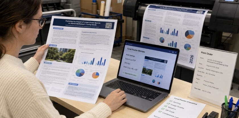
Print a draft on A4 or Letter first, because what looks fine on screen often falls apart on paper. Then work through these checks:
Text and content
- Read every heading out loud. If it sounds awkward, rewrite it.
- Check that your research question is clearly stated and your key message can be found in under 10 seconds.
- Spell-check is not enough. Read backwards, sentence by sentence, to catch typos your brain autocorrects.
- Verify names, institution and affiliation, and check every number against your data. One missed digit in a p-value or a misspelled co-author name is the kind of thing people remember.
- Check the acknowledgements, funding numbers and references, and make sure no placeholder text such as “Lorem ipsum” or [INSERT FIGURE] is still hiding somewhere.
Visual checks
- Step back about a metre from a printed draft, or three feet from your monitor. Can you still read the section headings?
- Is the title the loudest thing on the page, and are the columns roughly even?
- Check image captions, which are almost always forgotten until it is too late.
- Confirm the colour scheme works in greyscale, because some printers default to black and white without warning you.
Ask one other person to read it cold, ideally someone who did not work on the research. They will spot the confusing sentence you have read so many times it stopped registering. A checklist pass the day before submission takes about twenty minutes.
File format and resolution: PDF or PNG
PDF is almost always the right choice for print. It keeps text and shapes sharp at any scale, and it is what most print shops ask for. If you built the poster in Illustrator or Inkscape, export as PDF/X-1a or PDF/X-4, which are print-production standards. From PowerPoint or Google Slides, use the built-in export to PDF rather than printing to PDF through your operating system, because the native export preserves fonts and vector elements more reliably.
PNG is fine for digital display or upload to a conference website, but it is a raster format, so its print quality is fixed by the DPI you export. At poster scale, a low-resolution PNG looks sharp on a laptop and blurry on the wall. A 96 dpi PNG sent to the printer produces a blurry result, so aim for about 300 dpi at the final dimensions, check the pixel dimensions rather than the file size, and ask your printer if a lower figure is acceptable. As a rule: if it is going to a printer, send a PDF, and if it is going online, PNG is fine. If the conference asks for a screen-sized digital poster, follow its pixel size; Fourwaves lists 1920 × 1080 px (16:9) as a common HD screen size.
What to confirm before sending to print
- Size: A0, A1, 36 × 48 inches and 48 × 36 inches are not interchangeable. Export at the exact specified size, and check any weight limit if the poster is being mailed.
- Bleed and margins: printers cannot print right to the edge, so leave margins around the outer border, and note that many professional printers ask for a few millimetres of bleed beyond the trim edge, so check the exact figure with yours. If backgrounds or images run to the edge, extend them into the bleed or you may get a white hairline border.
- Fonts embedded: open the PDF and check that fonts are not substituted. In Adobe Acrobat, File → Properties → Fonts should list each as “Embedded Subset”. Otherwise the printer’s system may swap in something generic and shift your layout.
- Resolution: ask your print provider what they require before you export, not after. Large A0 files at 300 dpi can run to several hundred megabytes, and some services limit upload size.
- Colour mode: print uses CMYK and screens use RGB. An RGB file can shift in print, so blues turn purple and oranges go muddy. Convert to CMYK before the final export or ask the shop whether it converts for you.
- Proof: if time allows, get a smaller test print locally. Catching a typo on a cheap proof beats spotting it on a full-size poster you are about to pin up.
Order early. Print services, including university ones, often get busy before major conferences, and shops near conference venues can charge a premium. Ask your provider for its turnaround time and add a safety margin.
Expert and Institutional Guidance on Poster Design
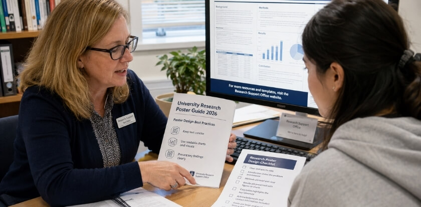
Start with your own institution. Many university libraries and graduate schools keep poster design pages with downloadable templates, recommended fonts and size guides for the most common formats, usually A0, 36 × 48 inches or 48 × 36 inches. If yours has one, use it rather than starting from a blank canvas.
What university guides agree on
Published university and conference poster guides cluster around the same principles: two or three columns rather than one dense block, body text of about 24 pt or larger, and high contrast between text and background. Comfortable reading distance is the reason, since text should be legible from roughly one to two metres. Exact title sizes and resolution targets vary between guides, which is why your own conference or institution comes first.
Guidance from software providers and style manuals
Canva’s education resources and Adobe’s tutorials cover poster composition from a design angle rather than an academic one, which is useful for hierarchy, colour contrast and font pairing. Adobe’s documentation also explains why print resolution matters at large format. PowerPoint and Google Slides help pages both tell you to set the canvas size before adding content. If your discipline has a formal style manual, check whether it covers poster presentations and how it treats affiliation lines, acknowledgements and citation density. Keep citations minimal on the poster, and consider a QR code or handout for the full reference list.
Frequently Asked Questions (FAQ)
Building a poster in PowerPoint, Google Slides or Canva leads to the same design calls: poster size, font size, word count, columns, colour scheme and when the file should reach the printer.
What size should an academic conference poster be?
Whatever the conference specifies. A0 (841 × 1189 mm) is common at international events, and 36 × 48 or 48 × 36 inches in North America. Read the official requirements before opening any design tool, because a wrong size found the night before printing is costly.
Can I make a conference poster in PowerPoint?
Yes. Set Design, Slide Size, Custom Slide Size to your poster dimensions first; Microsoft’s limit is 56 inches per side, so A0 and 36 × 48 inches fit. Embed high-resolution images (about 300 dpi) rather than pasting from websites.
Can I use Google Slides for a conference poster?
Yes, and it is free. Set a custom page size, build the layout and export as PDF. The drawbacks are fewer typography controls and inconsistent image handling at large sizes, so test-print a section at scale before a full print run.
Is Canva good enough for a conference poster?
Often yes. Canva is fast and gives clean layouts, and it can export print-ready PDFs. It falls short on precise CMYK colour control and fine typography. If your print service asks for specific colour profiles, check Canva’s export options before committing.
What is the difference between exporting as PDF and PNG?
Export as PDF for print, because it keeps text and vector shapes sharp and embeds fonts. PNG is a pixel image, so print quality depends on the DPI you export; aim for about 300 dpi at final size. Some conferences collect PNG or compressed PDF files for online archives.
How do I know if my fonts will print correctly?
Embedded fonts print as designed, while non-embedded fonts can be substituted by the printer and shift your layout. Look for an embed-fonts option when exporting from PowerPoint or Google Slides. In Illustrator or Inkscape, convert text to outlines before export, and keep a copy with live text for later edits.
How many words should a conference poster have?
About 300 to 800 words in total, according to Warwick’s WorldCUR/BCUR 2023 guidance and the ISIR poster guidelines. Some conferences set their own limit, so check the instructions first, and cut text before shrinking the font.
What font size should a research poster use?
At least 24 pt for body text and 72 pt or more for the title, a common guide figure. Headings sit between them. Follow your conference’s own numbers if it gives any.
What is a good colour scheme for an academic poster?
A light background with dark text is the easiest to read. Add one or two accent colours for headings and highlights, and use them consistently. Many universities publish official hex or Pantone codes for brand colours. Avoid red and green together, which is the classic colour-blindness problem.
How many columns should a conference poster have?
Two or three. Three columns is the most common for A0 portrait because it creates a clear left-to-right reading path, and wide landscape posters sometimes use four. Keep the column layout consistent throughout, because sections that span different numbers of columns are harder to follow.
Do I need to include acknowledgements?
Usually yes. Funding bodies often require acknowledgement as a condition of the grant. Put it at the bottom in a smaller font, with affiliation details and any conflict-of-interest statement, and check your funding terms for required wording.
How early should I send my poster to the printer?
As early as you can. Turnaround varies by print service and gets longer before major conferences, so ask your provider for its lead time and add a margin. Confirm file specifications first, because large A0 PDFs can hit upload limits.
Conclusion: Your Poster Is Ready. What Are the Next Steps?
Finishing the file is not the last step. Before you travel, take care of these points:
- Prepare a short spoken pitch. Know your research question cold, your main finding in one sentence and one implication that makes it worth caring about. You do not need a script, only a clear thread.
- Carry a digital backup. Save the poster as both a PDF and a high-resolution PNG on a phone or USB drive. If the printed copy is lost or damaged in transit, some venues have on-site printing.
- Keep the editable source file. You will want it for your next conference, for figures in a journal submission or when a supervisor asks for an update months from now.
- Share it afterwards. Many researchers post their poster on ResearchGate, an institutional repository or a personal site, which extends its reach beyond one room and one afternoon.
The skills you build here, from visual hierarchy and typography to a clean colour scheme and a disciplined column layout, transfer directly to your next poster, and each one gets faster.