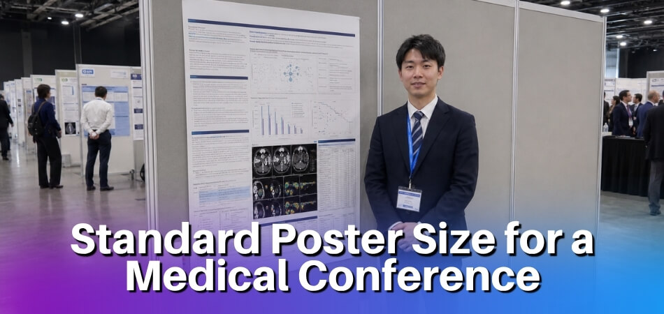
The standard poster size for a medical conference is commonly 36 x 48 inches, although some events may allow 42 x 56 inches, A0, or custom dimensions. The correct size is always the one listed in the official conference guidelines, because display boards, orientation rules, and printing requirements can vary from one event to another.
A medical conference poster must be large enough to present the research question, methods, results, visuals, and conclusion clearly. It should also be easy to read during a busy poster session, where attendees often scan several posters in a short time. The best poster size is not simply the largest option; it is the size that fits the assigned display area and supports a clean, readable layout.
For medical presenters, poster size also affects how the research is understood. A well-sized poster gives room for clinical context, data displays, and takeaway points without forcing the viewer to read dense paragraphs. It helps researchers communicate their work in a format that supports discussion and feedback.
Standard Poster Size for a Medical Conference
A 36 x 48 inch poster is one of the most common sizes used for medical and scientific conferences. It provides enough space for the main research sections while remaining practical for printing, transport, and display.
Still, there is no universal size that applies to every medical conference. Some events use larger boards, some follow international paper sizes, and others set exact maximum dimensions. Before creating the final design, always review the presenter’s instructions or abstract acceptance details.
This is especially important when submitting to a conference outside your usual region. Some conferences list poster dimensions in inches, while others use metric paper sizes. Treat the official conference instructions as the final authority and design around them from the beginning.
Common Medical Conference Poster Dimensions
The most common medical conference poster dimensions include:
| Poster Size | Best Use |
| 36 x 48 inches | Standard research posters with balanced text and visuals |
| 42 x 56 inches | Larger studies with multiple figures, tables, or data sections |
| A0 size | International or academic conferences using metric paper standards |
| Custom size | Events with specific display board or venue requirements |
A 36 x 48-inch poster is often the safest choice when no specific size is provided. A 42 x 56 inch poster gives more room for complex data, but it should not be overloaded with text. A0 may appear in guidelines for conferences outside North America or events that use metric sizing.
Portrait and Landscape Poster Orientation
Medical conference posters may be designed in portrait or landscape orientation. Landscape is common for research posters because it supports a left-to-right reading flow and gives more horizontal space for charts, tables, and section columns.
Portrait orientation may be required when the display board is narrow or vertical. It can also work for shorter case reports, simple studies, or posters with fewer figures.
Choose orientation based on:
- Conference instructions
- Display board shape
- Amount of content
- Number of visuals
- Preferred reading flow
If the conference requires a specific orientation, follow it exactly. Choosing the wrong orientation can cause layout problems and may make the poster difficult to mount.
Conference-Specific Poster Size Requirements
The conference’s official poster instructions should always override general poster size advice. Even though 36 x 48 inches is common, an event may require another size based on the available display boards.
Before printing, check for:
- Maximum poster width and height
- Required orientation
- File format for submission or printing
- Mounting instructions
- Poster board number or assigned space
- Setup and removal times
- Rules for QR codes, logos, or acknowledgments
Following these details helps you avoid resizing issues, printing errors, and display problems at the venue.
Importance of Poster Size at Medical Conferences
Poster size matters because it affects readability, visibility, organization, and audience engagement. A poster that is too small may be overlooked, while a poster that is too large may not fit the assigned space.

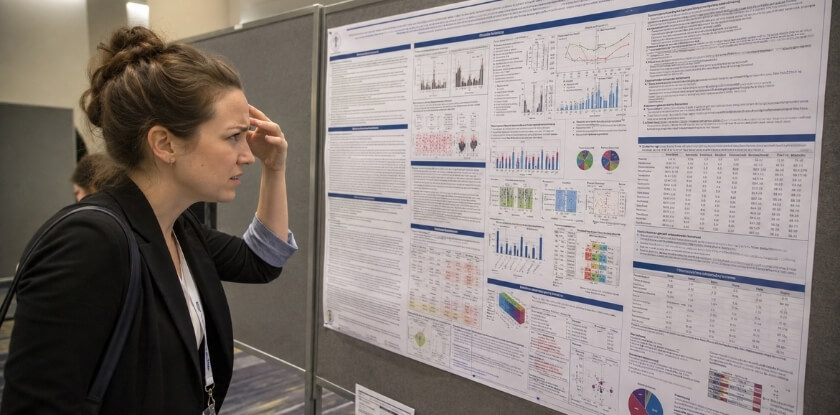
During a poster session, viewers often have limited time. The correct size helps them understand your research quickly and encourages meaningful discussion.
Readability and Visibility
A medical conference poster should be readable from a normal viewing distance. Standard dimensions allow you to use a large title, clear section headings, readable body text, and properly sized figures.
Readability depends on both size and layout. A large poster with dense text can still be hard to read. A smaller poster with strong headings, short text, and clear visuals may communicate better.
To improve readability:
- Use a large title
- Keep headings clear
- Avoid long paragraphs
- Use bullet points for key details
- Make figures and tables large enough to read
- Leave enough space between sections
The easier your poster is to scan, the more likely attendees are to stop and engage with it. Clear visibility is also useful when a presenter is speaking with one attendee while others are reading nearby. A poster should be able to communicate the main message even before the presenter explains it.
Space for Research Data and Visuals
Medical posters often include study design, patient data, outcomes, statistical results, figures, tables, and conclusions. A proper poster size gives these elements enough room without making the layout crowded.
Visuals are especially important. Graphs, tables, study flow diagrams, medical images, and charts can explain results faster than text. The poster size should allow these visuals to appear clearly with readable labels and captions.
A good poster should include only the data that supports the main research message. It does not need every detail from the full paper or abstract. In many cases, one strong chart and one well-organized table are more effective than several crowded visuals. The available poster space should guide the viewer toward the strongest evidence, not bury the conclusion under too many details.
Professional Presentation Standards
Using the correct poster size shows that you followed the conference instructions and prepared carefully. Medical conferences bring together clinicians, researchers, students, educators, and healthcare professionals. A polished poster helps create a strong professional impression.
A professional poster should:
- Fit the assigned display space
- Follow the required dimensions
- Present information in a logical order
- Use consistent formatting
- Support findings with clear data
- Make the conclusion easy to find
A poster that does not fit properly or looks crowded can distract from the quality of the research. Correct sizing also helps with the practical side of the session. When the poster fits the board, setup is faster, the edges stay neat, and the final display looks intentional rather than rushed.
Common Medical Conference Poster Sizes
Common medical conference poster sizes include 36 x 48 inches, 42 x 56 inches, A0, and custom dimensions. The right choice depends on the conference rules, venue setup, and the amount of information you need to present.
36 x 48 Inch Medical Conference Poster
A 36 x 48 inch medical conference poster is widely used because it balances space, readability, and convenience. It is suitable for many research posters, including clinical studies, case reports, reviews, and student presentations.
This size works well for:
- Title and author details
- Background or objective
- Methods summary
- Key results
- Charts or tables
- Short conclusion
- References and contact details
It is also practical for printing and travel. The size is large enough to look professional but still manageable in a poster tube or print shop workflow. For first-time presenters, this size is often easier to design because many poster templates already support it. It gives enough room for a traditional three-column layout without making the reader move too far across the display.
42 x 56 Inch Medical Conference Poster
A 42 x 56 inch poster provides more space for research that includes larger visuals or multiple result sections. It can be useful for clinical trials, comparative studies, multi-part projects, or posters with several figures.
This larger format may help when your poster needs:
- Multiple charts
- Detailed tables
- Study diagrams
- Imaging examples
- Subgroup comparisons
- More visual separation between sections
The extra space should be used to improve clarity, not to add unnecessary text. Before choosing this size, confirm that the conference board can support it. Use the larger area to increase figure size, improve spacing, and make the conclusion more visible. Avoid filling the extra space with long background explanations that attendees can discuss with you in person.
A0 Medical Conference Poster
An A0 medical conference poster is common at some academic and international events. A0 is a metric paper size, so it may appear in guidelines for conferences that follow international print standards.
A0 may be suitable when:
- The conference specifically requests it
- Guidelines use metric dimensions
- The event is hosted internationally
- A formal academic poster format is expected
A0 can be used in portrait or landscape orientation, but the correct orientation depends on the event’s display setup. If a conference lists A0 but does not clarify orientation, check the presenter portal or contact the organizer. Designing A0 in the wrong direction can make the poster difficult to mount even if the paper size itself is accepted.
Custom Medical Conference Poster Sizes
Some conferences require custom poster sizes because of venue limits or fixed board dimensions. These events may provide exact measurements or a maximum size that presenters must not exceed.
Custom sizes are common when:
- Display boards are smaller than usual
- Posters are arranged close together
- The event uses digital and printed formats
- The venue has strict space limits
- Organizers want visual consistency
If the conference gives a custom size, use it exactly. Do not assume that a standard size will be accepted. When a maximum size is given, your poster can often be smaller, but it should still look complete and visible. A poster that uses too little of the available area may appear less polished beside full-size displays.
Choosing the Right Poster Size Before Printing
Choose your poster size by checking the official guidelines, board dimensions, orientation rules, and printing requirements before finalizing the design. This prevents last-minute resizing and layout problems.
Conference Poster Instructions
The presenter instructions are the most important source for poster size. They may appear on the conference website, in the abstract acceptance email, or in a speaker portal.
Check for:
- Poster width and height
- Maximum size limits
- Portrait or landscape rules
- File submission format
- Display setup instructions
- Required disclosures or acknowledgments
If the event gives an exact size, use that size. If it gives only a maximum size, stay within that limit. Do this before designing the poster, not after. Changing poster dimensions at the end can shift columns, distort images, and force you to reduce fonts below a readable size.
Display Board Dimensions
The display board controls how much physical space your poster can use. A poster may look perfect in the design file but fail at the venue if it does not fit the board.
Confirm:
- Board width and height
- Orientation support
- Mounting method
- Space shared with other posters
- Whether the poster must fit inside a marked area
Leaving a small margin within the allowed size can make mounting easier and prevent a cramped appearance. It also helps protect important content from being too close to the poster edge, where trimming, curling, or mounting clips may interfere with readability.
Research Content and Poster Size
The amount of content should influence your poster size. A simple case report may not need as much space as a clinical trial, systematic review, or multi-site study.
A larger poster may be useful for:
- Several outcome measures
- Multiple figures
- Study flow diagrams
- Medical imaging
- Large comparison tables
However, increasing the poster size is not always the best solution. Often, the better approach is to shorten text, remove less important details, and use visuals more effectively. If the design feels crowded, first review whether every section is necessary. A focused poster is usually stronger than a larger poster that includes too much information.
Printing, Travel, and Setup Considerations
Practical factors also matter. A very large poster can be harder to print, transport, and mount. Before selecting the final size, consider:
- Printing cost
- Print material
- Travel distance
- Poster tube size
- Airline or public transport limits
- Local printing options near the venue
- Setup time
Fabric posters may be easier to carry because they can be folded. Paper posters can look crisp but usually require a tube. Choose a size and material that fit your travel and presentation plan. If you are flying to the event, think about how you will carry the poster through airports, hotels, and the conference venue. If you are printing locally, confirm the shop can produce the exact size and finish before the deadline.
Essential Elements of a Medical Conference Poster
A medical conference poster should include the title, authors, affiliations, background, objective, methods, results, conclusion, references, acknowledgments, and contact details. These elements help viewers understand the study quickly.
Poster Title, Authors, and Affiliations
The title should clearly state the topic and focus of the research. It should be specific, readable, and not overly long.
A strong title may include:
- The condition or population studied
- The intervention, exposure, or topic
- The outcome or research focus
- The study type, if relevant
Below the title, list the authors and institutional affiliations. Use the same author order as the accepted abstract unless the conference instructs otherwise. Include department names, hospitals, universities, or research centers if required. If your institution or sponsor logo is included, keep it proportional and avoid letting it dominate the research title.
Background or Research Question
The background section should briefly explain why the study was needed. It should identify the problem, knowledge gap, or clinical issue behind the research.
This section may answer:
- What is the issue being studied?
- What is already known?
- What gap remains?
- Why does the topic matter?
After the background, include a clear objective, research question, or hypothesis. This helps viewers understand what the study aimed to find. The objective should be easy to locate and should connect directly to the results and conclusion. If the objective is unclear, the rest of the poster becomes harder to interpret.
Methods or Study Design
The methods section explains how the research was conducted. It should be clear but not overloaded with procedural details.
Depending on the project, include:
- Study design
- Setting
- Participants or patient population
- Inclusion and exclusion criteria
- Intervention or comparison group
- Data collection method
- Outcome measures
- Analysis approach
- Ethical approval, if required
If the method is complex, a flow diagram can make it easier to understand. For example, a study selection diagram can show screening, exclusion, and final sample size more efficiently than a paragraph. This is useful for reviews and projects with multiple participant groups.
Results, Figures, and Tables
The results section should present the main findings using clear visuals and concise explanations. Focus on results that answer the research question.
Useful result elements include:
- Key numerical findings
- Primary outcome results
- Relevant comparisons
- Confidence intervals or statistical values, when appropriate
- Sample characteristics
- Trends or patterns
Figures and tables should be large enough to read. Each visual needs a clear title, labels, units, and a short caption if needed. Avoid visuals that do not support the main message.
Conclusion and Clinical Relevance
The conclusion should summarize the main takeaway from the research. It should connect directly to the objective and results.
A useful conclusion may include:
- Main finding
- Significance of the result
- Clinical or research relevance
- Important limitations
- Suggested next steps
Avoid overstating the findings. If the study is small, preliminary, or limited to one setting, the conclusion should reflect that. Medical audiences expect conclusions to match the strength of the evidence. A balanced conclusion is more credible than a broad claim that the data cannot fully support.
References, Acknowledgments, and Contact Details
References should be limited to the most relevant sources. Use the format required by the conference or institution.
Acknowledgments may include mentors, funding organizations, participating institutions, and research support teams. Contact details may include an email address or QR code, if allowed. A QR code can link to a full paper, abstract, or author profile, but it should not replace the essential poster content. Viewers should still understand the main study without scanning anything. Use contact details and QR codes for follow-up, not as a substitute for clear poster writing.
Medical Conference Poster Design Guidelines
A medical conference poster should be designed for fast reading, clear navigation, and accurate interpretation. The goal is not decoration; the goal is communication. A clean design helps attendees focus on the findings instead of the format. Every design decision should make the poster easier to read, easier to navigate, or easier to discuss.

Clear Reading Path
A clear reading path helps viewers move through the poster in a logical order. Most medical posters follow a structure similar to an abstract: background, objective, methods, results, and conclusion.
Use a layout that flows naturally from left to right and top to bottom. Keep related information together. Place the results section where it is easy to see, because it is often the most important part of the poster. The conclusion should also be easy to find. Many viewers look for the takeaway first, then decide whether to examine the methods and data in more detail.
Legible Poster Fonts
Use fonts that are clean and easy to read. The title should be the largest text, followed by section headings, body text, captions, and references.
A simple font hierarchy helps viewers scan the poster quickly. Avoid decorative fonts, too many font styles, or text that becomes too small after printing. If you are unsure whether the text is readable, print a small test section at actual size or zoom into the final file to inspect headings, body copy, captions, and chart labels.
Concise Poster Text
A poster should not read like a full manuscript. Use short sentences, bullet points, and focused statements. Each section should have a clear purpose.
Keep the background brief, summarize the methods, and prioritize the results. Remove repeated ideas, excessive definitions, and details that can be explained during discussion. A poster should invite conversation. It should not attempt to answer every possible question before the presenter has a chance to speak.
Charts, Tables, and Visual Evidence
Charts, tables, figures, and diagrams help viewers understand findings quickly. Use visuals for comparisons, patterns, trends, study flow, and key outcomes.
Every visual should be easy to interpret. Include labels, legends, units, and captions where needed. Simplify tables instead of copying detailed manuscript tables into the poster. Use rounded values where appropriate, remove unnecessary columns, and highlight the numbers that matter most. A table should be readable quickly, not studied like a full appendix.
White Space and Poster Balance
White space improves readability. It separates sections, frames visuals, and prevents the poster from looking crowded.
Do not fill every empty area with text or graphics. A balanced poster looks more professional and helps viewers focus on the most important information. White space can also separate dense scientific content into smaller, more manageable parts. This is especially useful when your poster includes several figures or technical terms.
Consistent Colors and Formatting
Use a simple color scheme and consistent formatting. Headings, captions, bullet points, and figures should follow a clear visual pattern.
Avoid too many colors or decorative effects. Good contrast between text and background is essential. Formatting should support the research, not compete with it. Use color to guide attention to headings, key findings, or visual categories. Avoid color combinations that reduce contrast or make text difficult to read.
Steps to Make a Medical Conference Poster
To make a medical conference poster, define the main message, organize the content, select a layout, build visuals, edit carefully, and prepare the final file for printing.
Define the Main Research Message
The main research message is the key point attendees should remember. It should be based on the objective and the most important result.
Ask:
- What problem does the study address?
- What was the objective?
- What was the main finding?
- Why does it matter?
- What should viewers remember?
Use this message to decide what belongs on the poster. If a figure, paragraph, or table does not support that message, consider removing or simplifying it. This keeps the poster focused and prevents the design from becoming crowded.
Organize the Research Content
Organize the poster into standard sections:
- Title and authors
- Background
- Objective
- Methods
- Results
- Conclusion
- References and acknowledgments
- Contact details
Keep each section focused. The background should not become a literature review, and the methods should not include every technical detail.
Select the Poster Layout
Choose a layout that matches your size, orientation, and content. Common options include:
- Three-column layout for standard research posters
- Two-column layout for large visuals
- Central-results layout when findings are the main focus
- Portrait layout for vertical boards
- Landscape layout for wide displays
The layout should guide the viewer smoothly from the title to the conclusion. Keep section widths consistent and align elements carefully. Small alignment problems can make a poster look less polished even when the content is strong.
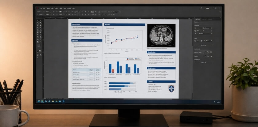
Build Visuals and Data Displays
Create visuals that support the main findings. Useful visuals include bar charts, line graphs, flow diagrams, tables, clinical images, and process diagrams.
Each visual should answer a question or explain a result. Avoid decorative graphics that do not add meaning. Make sure all images are high quality and readable when printed. Do not stretch low-resolution images to fill space. If a chart or image becomes blurry, recreate it at a higher quality before exporting the final file.
Edit for Clarity and Accuracy
Review the poster for accuracy, consistency, and readability. Check:
- Spelling and grammar
- Data values
- Figure labels
- Units
- Author names
- Affiliations
- Formatting
- Unsupported claims
- Overcrowded sections
Ask a colleague, mentor, or co-author to review it before printing. A fresh reader can catch mistakes you may miss. Reviewers can also tell you whether the main message is obvious without explanation. If they cannot identify the objective and conclusion quickly, revise the layout or wording.
Prepare the Final File for Printing
Before printing, confirm that the final file matches the conference and printer requirements. Check the size, orientation, margins, font display, image quality, and file format.
Many presenters use PDF because it preserves layout and fonts. Open the exported file before sending it to the printer to make sure nothing shifted during export. Check the file at high zoom and inspect every chart, symbol, author name, and section heading. Final file review is one of the simplest ways to prevent expensive reprints.
Medical Conference Poster Presentation Tips
A medical conference poster presentation should be clear, brief, and discussion-friendly. The poster explains the research visually, while the presenter adds context and answers questions. Your role is not to recite every word on the board. Instead, guide the viewer toward the main finding and explain details based on their interest.
Quick Poster Comprehension
Your poster should be understandable within a short time. Viewers should quickly identify the topic, objective, main result, and conclusion.
To support quick comprehension:
- Make the title clear
- Use direct headings
- Keep results visible
- Highlight the main finding
- Use visuals instead of long explanations
- Keep the conclusion short
A strong poster helps viewers answer: What was studied, what was found, and why does it matter?
Short Verbal Summary
Prepare a short verbal summary for attendees. It should explain the problem, purpose, method, result, and meaning of the study.
A simple structure is:
- Problem: What issue was studied?
- Purpose: What was the objective?
- Method: How was the study done?
- Result: What was found?
- Meaning: Why is it important?
Do not read directly from the poster. Use the summary to guide the discussion. Practice the summary enough that it sounds natural, but keep it flexible. Some attendees will want a quick overview, while others will ask detailed technical questions.
Questions and Discussion
Poster sessions are built for interaction. Be ready to answer questions about study design, sample size, data collection, analysis, limitations, and clinical relevance.
If you do not know the answer, be honest. Explain what you can and offer to follow up if needed. Questions can also help improve future research or identify collaboration opportunities. Write down useful feedback after the session, especially comments about methods, limitations, or clinical application. These insights may help improve a manuscript, future abstract, or next research project.
Supporting Materials for Presenters
Supporting materials can help with follow-up. Useful items include:
- Business cards
- Contact details
- QR code
- One-page summary, if allowed
- Supplementary references
- Notes with key talking points
The poster should still contain the essential information. Supporting materials should add value, not replace the main content. If you use a QR code, place it near the contact section and label what it opens, such as a full abstract, publication, or professional profile.
Common Medical Conference Poster Mistakes
Common mistakes include using the wrong size, too much text, small fonts, unclear visuals, ignoring guidelines, and printing without proofreading. These issues can weaken an otherwise strong research presentation.
Wrong Poster Size
Using the wrong size can create problems during setup. A poster that is too large may not fit the board, while a poster that is too small may look less visible.
Avoid this by checking the required size before designing. Confirm width, height, orientation, and display limits. Resizing a completed poster can damage the layout and reduce image quality. It can also change the balance between text and visuals, making once-readable sections too small. Confirm size at the beginning to avoid rebuilding the design later.
Too Much Poster Text
Too much text makes a poster difficult to scan. A medical poster should summarize research, not reproduce a full manuscript.
Reduce text by using bullet points, removing repetition, shortening the background, and focusing on the most important findings. Extra details can be discussed during the session or shared through a QR code if allowed. If you are tempted to add another paragraph, ask whether it helps the viewer understand the objective, methods, results, or conclusion. If not, leave it out.
Small Fonts and Low-Quality Images
Small fonts and blurry visuals make the poster hard to read. Viewers may miss key data if labels, values, or captions are unclear.
Check body text, headings, chart labels, table values, image resolution, and contrast before printing. If a visual looks unclear on screen, it will likely look worse in print. Use high-resolution figures, simplify chart legends, and make sure table text is not smaller than the rest of the poster body.
Ignored Conference Guidelines
Ignoring guidelines can lead to display or submission problems. Conferences may set rules for size, orientation, poster numbers, author formatting, disclosures, funding statements, QR codes, and setup times.
Compare your poster against the official requirements before printing or uploading the file. This check should happen after the poster is finished but before it is exported for final printing. It is easier to correct a file than to fix a printed poster.
Printing Without Proofreading
Printing without proofreading can leave visible errors on the final poster. Review title accuracy, author details, data values, labels, grammar, spacing, alignment, and contact information.
Ask another person to review the poster before printing. A second reviewer can catch errors in data, wording, or formatting. Proofreading should include both scientific accuracy and visual presentation. Even small mistakes can stand out on a large printed poster.
Medical Conference Poster Size FAQs
These FAQs answer common questions about medical conference poster size, orientation, printing format, and preparation timing. Use them as a quick reference before designing or printing your poster.
What Is the Most Common Medical Conference Poster Size?
The most common medical conference poster size is 36 x 48 inches. It provides enough space for research sections, visuals, and conclusions while remaining practical for printing, transport, and display.
Is 36 x 48 Inches Accepted at Most Medical Conferences?
Yes, 36 x 48 inches is accepted at many medical conferences, but not all. Always check the official poster guidelines because some events require different sizes, orientations, or display formats.
Can a Medical Conference Poster Be Smaller Than the Standard Size?
Yes, a smaller poster may be allowed if it fits within the conference’s maximum size limits. However, smaller posters can be less visible, so the title, headings, charts, and conclusion must remain easy to read.
Do Medical Conferences Allow A0 Posters?
Some medical conferences allow A0 posters, especially academic or international events that use metric sizing. Check whether the conference accepts A0 and whether it requires portrait or landscape orientation.
Should a Medical Poster Be Portrait or Landscape?
A medical poster can be portrait or landscape, depending on the conference rules. Landscape is common for research posters because it supports a clear left-to-right reading flow, while portrait may be required for vertical boards.
What File Format Should You Use for Printing a Conference Poster?
PDF is usually the best file format for printing a conference poster because it preserves fonts, layout, spacing, and images. Still, confirm the printer’s file requirements before sending the final version.
How Early Should You Print a Medical Conference Poster?
Print your medical conference poster several days before the event. Early printing gives you time to check the final result, correct errors, manage travel needs, and avoid last-minute printing delays.
Conclusion
The standard poster size for a medical conference is commonly 36 x 48 inches, but the right size depends on the specific event. Some conferences may accept 42 x 56 inches, A0, or custom dimensions based on the display board and venue setup.
Before printing, review the official poster guidelines, confirm the orientation, and make sure your content fits without crowding the layout. A strong medical conference poster should be readable, organized, visually clear, and focused on the main research message. When size, design, and content work together, your poster becomes easier to understand and more effective during discussion.