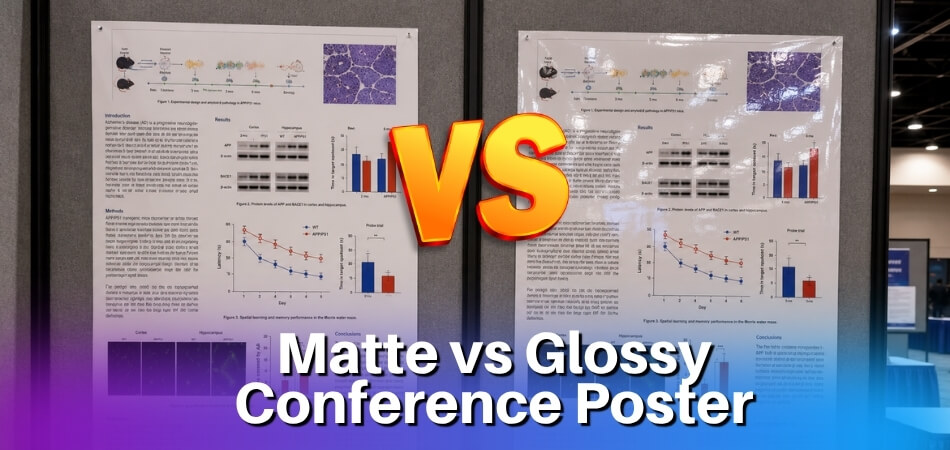
You’re standing at the print shop counter, print file open on your phone, poster dimensions confirmed — and then the person behind the counter asks: “Matte or glossy?” Your mind goes blank. If that question hits you right before you hit print, this article was written for you.
It might feel like a minor aesthetic choice, but the finish you pick can genuinely make or break how your poster reads in the room. Conference hall lighting is rarely kind. Fluorescent lighting and overhead lighting bounce off surfaces at odd angles, and a glossy finish turns your carefully formatted data table into a mirror. Attendees end up tilting their heads, shifting side to side, or simply moving on. That’s a problem no amount of good design can fix after the fact.
Conference posters should generally be printed on matte finish, because glossy surfaces create glare under the strong or uneven lighting common in conference halls, making text and data hard to read — however, glossy or satin finishes work better for photography-heavy posters or outdoor display settings. So no, this isn’t just personal taste. It’s a practical decision that depends on your venue lighting conditions, your content type, your paper weight, and sometimes even your print provider’s equipment.
In the sections below, we’ll work through all of it — from how inkjet printing and laser printing interact differently with coated surfaces, to whether UV coating or lamination is worth the extra cost, to a quick poster printing checklist you can use before your next submission deadline.
Matte vs Glossy: Key Differences at a Glance
The finish you pick changes more than just how your poster looks. It affects readability under specific lighting, how well ink adheres, and even how the poster holds up when someone leans in to read it. Here’s the quick breakdown.
Matte Finish
Matte finish absorbs light rather than reflecting it. That means zero glare — which is exactly what you want in a venue running fluorescent lighting or harsh overhead lighting overhead. Most conference halls fall into this category.
Text-heavy posters benefit the most here. A scientific research poster or academic poster with dense methodology sections, data tables, and references becomes genuinely easier to read on matte. Your audience won’t be tilting their heads to dodge a reflection.
Matte does have a trade-off. Colors look slightly flatter and less saturated compared to glossy. If your poster relies heavily on vivid charts or photography, that subdued tone can feel underwhelming.
On the practical side, matte paper typically handles inkjet printing well and is less likely to show fingerprints — useful when people are pointing at your data all afternoon.
Glossy Finish
Glossy finish reflects light. That’s the whole point — it makes colors pop, sharpens image contrast, and gives photos that crisp, almost luminous quality. A photography-heavy poster or a design-led brand display looks noticeably better on gloss.
But glare is a real problem. Conference hall lighting, especially fluorescent lighting, bounces straight off a glossy surface. Attendees end up shifting side to side just to find a readable angle. That’s a friction you don’t want between your work and your audience.
Glossy works better in dim venue settings or anywhere with controlled natural light. Outdoor display poster applications can also suit gloss, particularly when paired with UV coating or lamination for weather resistance.
One thing to know about production: glossy stock tends to be slightly less forgiving with laser printing. If your print provider uses laser, confirm compatibility before you finalize the order — some glossy papers curl or smear under high heat.
Satin and Semi-Gloss: The Middle Ground
If you’re genuinely torn, satin finish and semi-gloss finish exist for good reason. Satin sits between the two extremes — decent color vibrancy, reduced (not eliminated) glare. Semi-gloss leans closer to glossy but softens the reflectivity enough to work under moderate overhead lighting.
For most conference posters, satin is the compromise worth considering. You get richer color than pure matte without the glare penalty of full gloss. Many print providers offer it at no extra cost — just ask specifically for satin when placing your order.
Paper Weight Matters Too
Finish and paper weight work together. A glossy finish on 80gsm paper will feel flimsy and curl at the edges, especially in warm venues. A matte finish on 170gsm or heavier stock feels authoritative, holds flat on a poster board, and survives a full two-day conference without looking wrecked.
Standard recommendation: go 150gsm minimum. If you’re shipping the poster rolled in a tube, 170–200gsm with a matte or satin finish is your safest bet for surviving transit and still lying flat when you unroll it.
Why Conference Hall Lighting Is the Most Important Factor
Most people pick a finish based on how the poster looks on their laptop screen. That’s the wrong starting point. The real question is: what does the lighting look like where your poster will actually hang?
Conference hall lighting varies wildly — and it directly determines whether your finish choice helps or kills readability.
Glare Problems Under Fluorescent and Overhead Lighting
Fluorescent lighting is the default in probably 80% of conference venues. It’s harsh, it’s directional, and it hits vertical surfaces at exactly the angle that turns glossy finish into a mirror.
Stand six feet from a glossy poster under fluorescent tubes and you’ll often see a bright wash across a third of the surface. Attendees shift left, shift right, and eventually give up trying to read your methodology section. This is a genuine problem at academic poster sessions — not an aesthetic preference.
Overhead lighting creates the same issue. The light source is above and slightly behind the viewer, which means it reflects straight off a glossy surface at eye level.
Matte finish eliminates this almost entirely. It scatters light rather than reflecting it back, so the text and figures stay readable from multiple angles. For a scientific research poster with dense charts and small-font captions, that matters a lot.
Satin finish and semi-gloss finish sit in the middle. They give you better color vibrancy than pure matte, but under direct fluorescent lighting, semi-gloss can still produce noticeable glare — less than full gloss, but enough to be annoying. If your venue has overhead lighting and you want some sheen, satin finish is usually the safer compromise.
One practical check: ask your print provider whether they offer a low-sheen lamination option. Some lamination finishes add durability without adding much reflectivity.
Which Finish Performs Better in Natural Light or Dim Venues
Natural light is softer and more diffused than fluorescent tubes, so glare is less of a problem. In a venue with large windows and decent daylight, a glossy finish or semi-gloss finish can actually work well — colors look richer, photography-heavy posters pop, and the overall print quality feels higher-end.
That said, natural light moves. Morning sun through east-facing windows is totally different from afternoon light through the same glass. If your poster session runs four hours and the light shifts, a finish that looked fine at 9am might be problematic by 1pm.
Dim venues are a different situation entirely. Low ambient light makes glare less of a concern, but it also makes contrast more important. A matte finish in a dim venue can look flat or dull if your color values aren’t strong. Glossy finish actually helps here — it reflects the available light back toward the viewer, making colors appear brighter without any adjustment on your end.
If you’re presenting at an outdoor display or in a tent-style exhibition area, UV coating becomes relevant. It protects the print surface from moisture and sunlight degradation. Most print providers offer UV coating on glossy stock; fewer offer it on matte, so ask specifically.
Bottom line: check venue lighting conditions before you finalize anything. A quick email to the event coordinator asking “what’s the lighting like in the poster hall?” takes 30 seconds and could save you a reprint.
How to Choose the Right Finish Based on Your Venue
The venue does most of the decision-making for you — if you let it.
Before you finalize anything with your print provider, find out what kind of lighting the conference hall uses. That single piece of information will point you toward the right finish faster than any other factor.
Fluorescent or Overhead Lighting (Most Common)
This is the setup you’ll find in the majority of convention centers, hotel ballrooms, and university conference rooms. Fluorescent tubes and overhead LED panels cast light from directly above, which creates a near-perfect angle for glare on glossy surfaces.
If your poster is glossy and it’s hanging at eye level under fluorescent lighting, there’s a real chance attendees will shift side to side trying to find an angle where they can actually read it. That’s not a great first impression.
Go with matte finish here. It absorbs that overhead light instead of bouncing it back. A scientific research poster or academic poster with dense text and charts becomes significantly easier to read under these conditions.
If you still want some visual pop — say your poster includes a few high-res images — consider a satin finish or semi-gloss finish instead of full gloss. You get modest color vibrancy without the harsh reflection problem.
Dim or Low-Light Venues
Dimly lit conference spaces actually flip the equation. When ambient light is low, glare stops being an issue, and glossy finish starts earning its keep. Colors look richer, contrast is sharper, and your poster stands out in a way that matte simply can’t match under those conditions.
Photography-heavy posters — product showcases, case study visuals, brand campaigns — do well with gloss in dim venues. The finish amplifies the saturation in a way that feels intentional rather than excessive.
Still want to hedge? Satin finish works here too. It’s the reliable middle ground.
Natural Light or Mixed Lighting
Natural light is unpredictable. Morning sun hits at a low angle. Afternoon light shifts. If your poster is near a window or in a space with mixed natural and artificial lighting, glossy finish becomes a gamble.
Matte holds up better across changing light conditions. It won’t look dramatically different at 9am versus 3pm.
Outdoor Display or High-Traffic Areas
For an outdoor display poster or anything that’ll be mounted near an entrance where people walk past quickly, glossy with a UV coating tends to hold up better physically. It resists moisture and fingerprints. Lamination adds another layer of protection if the poster is going to be handled or re-used.
Paper weight matters here too. For outdoor or high-traffic use, anything under 200gsm will feel flimsy and may warp. Ask your print provider about 250gsm or heavier stock when durability is a priority.
A Quick Decision Checklist Before You Print
Run through these before you confirm the job:
- What’s the lighting? Fluorescent/overhead → matte. Dim/low-light → gloss or satin. Natural/mixed → matte or satin.
- What’s on the poster? Text-heavy academic poster → matte. Photography-heavy → gloss or satin.
- Where will it hang? Poster board indoors → standard weight (170–200gsm). Outdoor or reusable → 250gsm+, UV coating or lamination.
- What’s your print method? Inkjet printing handles both finishes well. Laser printing can sometimes struggle with full gloss — check with your print provider first.
- What’s the turnaround time? If you’re rushing, matte is more forgiving. Gloss shows dust and handling marks during transport, especially if the poster is rolled rather than flat-packed.
That’s really the whole framework. Match finish to lighting, factor in your content type, and confirm the technical side with whoever is doing the actual printing. You’ll avoid most of the common mistakes before the poster ever leaves the shop.
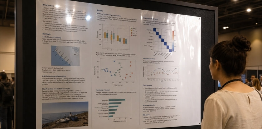
Which Finish Works Best for Scientific Research Posters
Scientific posters have a specific set of demands that most event or marketing posters don’t. You’re usually displaying dense text, data tables, charts, microscopy images, and statistical graphs — sometimes all on the same 36×48 inch sheet. The finish you pick affects how readable all of that actually is under conference hall lighting.

Matte Is the Default for Good Reason
Most academic poster sessions happen in large convention halls or hotel ballrooms running fluorescent lighting or bright overhead lighting. That kind of light bounces hard off glossy surfaces. Stand a meter away from a glossy scientific research poster under fluorescent tubes and you’ll likely see a wash of glare cutting right across your regression table or your results section.
Matte finish eliminates that problem almost entirely. The surface diffuses light instead of reflecting it, so text stays sharp and readable from multiple angles. For a poster with small-font axis labels, p-values, or literature citations, that readability difference is real.
There’s also a practical production reason. Scientific posters are almost always printed on inkjet printing systems using wide-format printers. Matte paper stock accepts inkjet ink evenly, produces accurate color on charts, and dries without smearing — useful if you’re picking up your poster the night before the conference.
When Glossy or Semi-Gloss Makes Sense
If your poster is heavy on high-resolution photography — clinical imaging, histology slides, field photography, electron microscopy — a satin finish or semi-gloss finish can make those images noticeably sharper and more vibrant than matte.
The trade-off is manageable if you know your venue lighting conditions in advance. A dim venue with low overhead lighting and no direct fluorescent exposure? Glossy or semi-gloss can work fine without the glare problem. Natural light from windows tends to be softer and less aggressive than artificial overhead lighting, so photography-heavy posters in naturally lit spaces often look excellent on semi-gloss stock.
The mistake researchers make is printing glossy because it “looks more professional” without checking the room setup first. It doesn’t always. In a standard fluorescent-lit conference hall, glossy looks washed out to anyone who isn’t standing at the exact right angle.
Paper Weight Matters Here Too
For academic posters, paper weight isn’t just about feel — it affects how the poster hangs on a poster board. Most poster sessions use push-pins or velcro strips on foam-core boards. Lightweight paper (under 90 gsm) can sag or tear at the pin points, especially with a large-format print.
A paper weight of 100–170 gsm is a reasonable range for conference use. Some print providers offer heavier matte stock at 200 gsm, which hangs flat and doesn’t curl at the edges. If you’re traveling with the poster rolled in a tube, heavier stock is also more resistant to crease lines forming.
Avoid UV coating or lamination on a standard scientific poster unless you’re printing an outdoor display poster or planning to reuse it multiple times. Lamination adds cost and turnaround time, and for a single academic session it’s rarely worth either.
Quick Rule of Thumb
Bright fluorescent venue, text-heavy content, standard conference setup — go matte, 100–150 gsm, inkjet printing. That’s the safe call for probably 80% of scientific poster situations. Introduce semi-gloss only if your imagery genuinely needs the color depth and you’ve confirmed the lighting won’t fight you.
Satin and Semi-Gloss: A Third Option Most People Overlook
Most people treat this as a binary choice. Matte or glossy, pick one, move on. But there are two finishes sitting right in the middle that most print providers offer and most conference presenters never ask about: satin and semi-gloss.
They’re not the same thing, though people use the terms interchangeably sometimes.
What Satin Actually Is
Satin finish has a soft sheen — noticeably smoother than matte, but nowhere near the mirror-like surface of full gloss. It reflects some light, but it doesn’t bounce harsh fluorescent lighting straight back at your viewer’s eyes. That matters a lot in a typical conference hall where overhead lighting is aggressive and uneven.
Colors print well on satin. You get better saturation than matte without the glare problem of glossy. If your poster has a mix of charts, diagrams, and a few photographs, satin handles all of it reasonably well. It’s a legitimate middle ground, not a compromise.
Semi-Gloss Is Slightly Different
Semi-gloss sits closer to the glossy end of the spectrum. The sheen is more pronounced than satin, and in dim venue conditions — evening receptions, darker breakout rooms, low-light exhibition halls — that extra reflectivity actually works in your favor. It gives printed colors more visible pop without needing natural light to pull it off.
The catch: in a room with strong fluorescent lighting directly above the poster board, semi-gloss will show glare. Not as bad as full gloss, but enough to be annoying at certain viewing angles. Walk past a semi-gloss poster at 45 degrees in a brightly lit room and you’ll see what I mean.
When to Actually Use These Finishes
Here’s a practical breakdown:
- Photography-heavy poster in a dim venue — semi-gloss is a solid call. The images look sharp and rich, and low venue lighting means glare isn’t a real problem.
- Mixed content poster, unknown lighting conditions — satin is probably your safest bet. It performs consistently across different venue lighting conditions without committing fully to either extreme.
- Outdoor display poster — avoid both. UV coating or lamination is a more pressing concern than finish sheen outdoors. Start with a matte or satin base, then ask your print provider about UV coating for weather resistance.
- Academic poster or scientific research poster — satin works well here. Dense text stays readable, and the slight sheen keeps data-heavy figures from looking flat.
One Practical Thing to Ask Your Print Provider
Not every print shop stocks satin or semi-gloss as a standard option for large-format inkjet printing. Laser printing on smaller formats gives you more finish variety, but for A0 or 36″x48″ conference posters, inkjet is almost always what’s being used. Ask specifically whether satin is available on their large-format stock and whether it affects turnaround time — sometimes specialty paper weights require a different machine or a longer queue.
Paper weight matters here too. A 200gsm satin stock feels noticeably more substantial on a poster board than a lightweight 130gsm glossy sheet. If you’re transporting the poster rolled in a tube, heavier paper is more forgiving when it unfurls.
Don’t overlook satin simply because it’s not part of the usual conversation. In a lot of real-world conference environments, it outperforms both of the options you were originally comparing.
Paper Weight and Why It Matters Just as Much as Finish
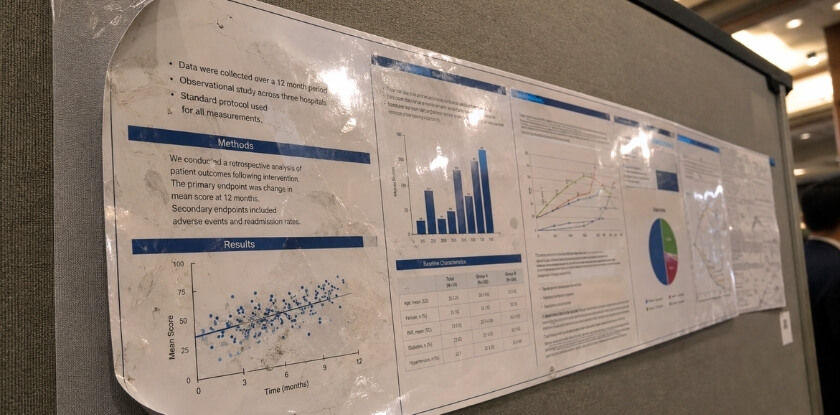
Most people spend all their time debating matte vs. glossy and then order their poster on whatever default paper the print provider suggests. That’s a mistake. The finish affects how your poster looks. The paper weight affects whether it actually survives the day.
Conference posters get handled. They get rolled, carried in tubes, pinned to poster boards, and occasionally bent by accident. A lightweight paper — anything under 150gsm — will show every crease and curl, and it’ll buckle if the venue has any humidity. That buckle ruins both finishes equally.
What GSM Range You Should Be Targeting
For a standard conference poster, 170gsm to 200gsm is the practical sweet spot. It’s thick enough to hang flat on a poster board without curling at the edges, but light enough to roll and transport without cracking.
Go heavier — 250gsm or above — and you’re looking at a stiffer, more rigid sheet. That works well if you’re printing a photography-heavy poster where you want the colors to pop and the surface to feel substantial. It does not roll easily, so you’ll need a hard-backed carry case rather than a tube.
Below 150gsm is really only acceptable if you’re printing a rough draft or a rehearsal copy. Don’t take it to the actual event.
How Finish and Weight Interact
Glossy finish on lightweight paper looks cheap. The sheen draws attention to any flex or bend in the sheet, and you’ll see every fingerprint the moment someone touches it. If you’re going glossy, you genuinely need the heavier stock to support it.
Matte finish is more forgiving on mid-weight paper. A 170gsm matte poster can look perfectly professional. The texture also helps it lie flat because it doesn’t have the same surface tension that a coated glossy sheet has.
Satin finish — which sits between the two — tends to work well at 190gsm to 200gsm. That combination handles both fluorescent lighting and overhead lighting better than most setups, and the weight keeps it stable on a poster board without pins pulling through.
Lamination and UV Coating Change the Equation
If your print provider offers lamination or UV coating as an add-on, the base paper weight becomes less critical — but not irrelevant. Lamination adds structural rigidity and a layer of protection against humidity and handling. A 150gsm laminated poster will behave like a 200gsm unlaminated one in most practical situations.
UV coating is mainly cosmetic. It adds a hard gloss layer on top of your printed surface, which can be useful for an outdoor display poster where weather exposure is a real concern. For a standard indoor academic poster or scientific research poster, it’s usually unnecessary.
One thing to check: inkjet printing and laser printing don’t both work on every paper stock. Inkjet needs a coated surface to prevent ink spread. Laser can handle uncoated stock better. Ask your print provider which process they use before you finalize the paper spec — ordering a 200gsm uncoated sheet for an inkjet run will leave you with blurry text.
A Quick Weight Reference
| Use Case | Recommended GSM | Notes |
|---|---|---|
| Standard academic poster | 170–190gsm | Rolls well, hangs flat |
| Photography-heavy poster | 200–250gsm | Use hard carry case |
| Outdoor display poster | 150gsm + lamination | Lamination handles weather |
| Budget/draft copy | 120–150gsm | Not for final presentation |
The number on the paper spec sheet is boring. The difference between a poster that hangs perfectly flat under conference hall lighting and one that curls at the corners is almost always that number.
Inkjet vs Laser Printing: How Your Print Method Affects Finish Choice
Most people pick a finish and then hand the file to a print provider without thinking about how the actual printing process interacts with that choice. That’s a mistake. Inkjet and laser printing behave differently on coated and uncoated surfaces, and the finish you spec out can look completely different depending on which machine produces it.
Inkjet Printing and Finish Compatibility
Large-format inkjet is the standard for conference poster printing. Most print shops running wide-format printers — think Epson SureColor or Canon imagePROGRAF series — use aqueous inks that absorb slightly into the paper surface. This matters because:
- Matte finish on inkjet stock gives excellent ink absorption, sharp text, and virtually zero glare. It’s the go-to for academic posters and scientific research posters with dense text columns.
- Glossy finish on inkjet can look vivid straight off the printer, but it’s more prone to fingerprints and scuffing. If your poster is handled a lot — passed around, pinned to a poster board, rolled and unrolled — gloss scratches show fast.
- Satin finish on inkjet is arguably the sweet spot. You get decent color saturation without the full mirror effect of gloss.
One practical note: aqueous inks on high-gloss coated stock can take longer to fully cure. If turnaround time is tight and you’re picking up prints the same day, a matte or satin stock will be drier and safer to handle.
Laser Printing Behaves Differently
Laser printing fuses toner to the surface using heat. It doesn’t absorb into the paper the way inkjet ink does — it sits on top. This changes how finishes look and perform.
On glossy laser paper, the toner creates a harder, shinier surface that can actually increase reflectivity beyond what you’d expect from the paper spec alone. Under fluorescent lighting or direct overhead lighting in a conference hall, this combination produces noticeable glare. Worse than inkjet gloss, in many cases.
Matte finish laser prints hold up better in those conditions. The toner layer on matte stock stays flat, keeps text legible, and holds fine detail well. If you’re printing a scientific research poster on a laser printer, matte is the safer call every time.
Laser-printed satin and semi-gloss finishes sit in an awkward middle ground. Some handle the toner well; some look slightly plasticky depending on the stock weight and brand. Ask your print provider for a test sheet before committing to a full run.
What About Lamination and UV Coating?
Both options are applied after printing, so they override the base paper finish to a degree.
UV coating adds a hard, protective layer. Gloss UV is extremely shiny — too shiny for most indoor conference environments with fluorescent lighting. Matte UV is more controlled, adds durability, and doesn’t create the glare problem. If you’re doing an outdoor display poster or something that needs to survive a multi-day event with heavy foot traffic, matte UV lamination is worth the extra cost.
Lamination on an inkjet print can trap outgassing from aqueous inks if it’s applied too quickly after printing. This can cause bubbling or cloudiness, especially on gloss laminate. Standard turnaround for laminated inkjet posters should include at least a few hours of drying time. If your print provider rushes this, it shows.
The Quick Rule
Inkjet on matte or satin — reliable, glare-resistant, handles venue lighting conditions well. Laser on matte — same logic. Gloss only makes sense if your poster is photography-heavy, you’ve confirmed the venue has natural light or dim lighting (not harsh fluorescent), and you’re not laminating on the same day it prints.
When in doubt, ask your print provider which paper stocks they actually stock in-house versus what they’ll order in. In-house stock is usually better calibrated to their machines, and you’ll see more consistent results regardless of the finish you choose.
Choosing a Print Provider and Planning for Turnaround Time
Most printing disasters at conferences aren’t about finish choice — they’re about running out of time and taking whatever the nearest print shop can produce.
Start your search at least two weeks before the conference. One week if you’re cutting it close. Anything less than 72 hours and your options shrink fast, which often means you’re stuck with whatever stock and finish the local copy shop has on hand that day.
What to Actually Ask Your Print Provider
Don’t just upload your file and hope. Call or email and ask specific questions:
- What paper stocks do you carry for large-format prints?
- Do you offer both matte and glossy finishes, or just one?
- Is lamination available, and does it add to the turnaround time?
- What file format and resolution do you need?
A good print provider will also tell you whether your file is set up correctly before they run the job. If they don’t offer that and just queue whatever you send, that’s a warning sign.
Online vs Local Print Shops
Online providers like Printingforless, GotPrint, or Staples’ online portal often have better paper stock variety and more consistent color calibration than a local copy shop. The tradeoff is shipping time. A 24×36 poster rolled in a tube ships fine, but factor in at least 3–5 business days for standard delivery on top of production time.
Local shops are worth it when you need to see a proof in person, or when you’re unsure about how a finish will look under your specific venue lighting. Some shops will run a small test print on both matte and glossy before committing to the full size — ask for that. It costs a few dollars and can save you from a bad decision.
UV Coating and Lamination Decisions
If you’re considering UV coating or lamination, decide that before you contact the printer — not after. Both add time. Lamination typically adds a day to production, sometimes two. UV coating is faster but not universally available at every shop.
Lamination gives you a tougher poster that survives being rolled and unrolled multiple times. If you’re presenting at more than one conference with the same poster, it’s worth it. For a single-use print, probably not necessary.
Poster Board and Mounting Options
Some venues provide a poster board with a specific surface — fabric, foam, or corkboard — and that affects how your print hangs and how the finish reads under light. A glossy print pinned to a fabric board at a slight angle can throw serious glare toward viewers. Worth checking the venue’s setup in advance if you can.
If you’re mounting the poster yourself, foam board backing is the most common option. It keeps the poster flat and stops that curling effect you get with an unmounted print. Most print providers offer this as an add-on, usually $15–$25 depending on size.
The Practical Checklist Before You Submit
Before you send your file to the printer, run through this:
- [ ] Confirmed venue lighting conditions (fluorescent, overhead, natural light, dim venue)
- [ ] Chosen finish based on lighting — matte for glare-heavy rooms, glossy or semi-gloss for dim venues or photography-heavy posters
- [ ] File is exported at 300 DPI minimum, correct dimensions
- [ ] Bleeds set correctly if your design goes edge to edge
- [ ] Decided on lamination or UV coating — and confirmed it fits your timeline
- [ ] Ordered at least 5–7 business days before you need it in hand
One last thing. Always order one day earlier than you think you need to. Printing delays happen. Color calibration issues happen. Leaving yourself a one-day buffer means the difference between scrambling and walking into your conference relaxed.
Quick Decision Checklist for Conference Poster Printing
Run through these questions before you send anything to print. Each answer should push you toward a clear choice.
About Your Venue
- Do you know the lighting setup? Fluorescent overhead lighting is the most common situation in conference halls. If that’s what you’re dealing with, matte or satin finish will almost always serve you better than glossy.
- Will your poster be near windows or natural light? Natural light changes throughout the day. A glossy finish that looked fine at 9am can become unreadable by noon if it catches direct sunlight.
- Is it a dim or low-light venue? This is one of the few situations where glossy actually helps — it reflects ambient light back toward the viewer and makes colors pop more than matte would.
- Outdoor display? Go matte with a UV coating. Glossy outdoors is a glare problem waiting to happen.
About Your Poster Content
- Mostly text and data? Matte. Full stop. Glare on dense text is exhausting to read from any angle.
- Photography-heavy poster with large images? Glossy or semi-gloss finish will make those images look sharper and more saturated.
- Scientific research poster or academic poster? Matte is the convention for a reason — readability at close range matters more than visual impact from across the room.
- Charts, graphs, and diagrams? Satin or semi-gloss gives you color accuracy without the harsh reflections of full gloss.
About Your Print Setup
- Using inkjet printing? Both finishes work, but inkjet on true glossy stock produces the most vivid color. If you’re going matte with inkjet, confirm the paper is specifically coated matte — uncoated matte on inkjet can look dull and slightly blurry.
- Using laser printing? Laser and high-gloss stock don’t always bond well. Check with your print provider before specifying a finish — some laser printers are limited to satin or semi-gloss at best.
- Getting it laminated? Cold lamination preserves color better than heat. If you’re adding lamination over a glossy print, make sure your print provider uses the right adhesive — wrong lamination over inkjet can cause bubbling.
- Adding UV coating? This works best on glossy or semi-gloss base prints. Applying UV coating over matte stock mostly just adds cost without much visible benefit.
About Logistics
- Tight turnaround time? Matte prints dry faster on most large-format inkjet setups. If you’re ordering same-day or next-day, ask your print provider which finish they can actually guarantee at that speed.
- Mounting to a poster board yourself? Matte is more forgiving to handle — glossy scratches visibly if you’re rolling, unrolling, or repositioning it under pressure.
- Presenting multiple times at different venues? Get matte or satin. It’s the more neutral choice across varied venue lighting conditions — glossy is harder to predict in rooms you haven’t scouted.
The Short Version
| Your Situation | Recommended Finish |
|---|---|
| Fluorescent conference lighting | Matte or satin |
| Dim venue, low ambient light | Glossy or semi-gloss |
| Text and data-heavy content | Matte |
| Photography-heavy content | Glossy or semi-gloss |
| Scientific or academic poster | Matte |
| Outdoor display poster | Matte + UV coating |
| Tight print deadline | Matte (faster turnaround) |
| Multiple venue presentations | Satin (most versatile) |
If you’re still on the fence after all that — go satin. It’s not a compromise finish. It genuinely performs well across most conference situations, and you won’t be second-guessing it when you’re standing next to your poster at 8am under fluorescent lights.
Frequently Asked Questions (FAQ)
Does matte finish always look better under fluorescent lighting?
Pretty much, yes. Fluorescent lighting creates a broad, flat glare that bounces directly off glossy surfaces. Matte absorbs that light instead of reflecting it, which means people standing at an angle to your poster can still read your content clearly. That said, if your venue has directional spotlights rather than overhead fluorescent banks, a satin finish can hold up fine without washing out.
Can I use glossy finish for an academic poster?
You can, but most print providers and conference veterans would talk you out of it. Scientific research posters typically get viewed under harsh indoor lighting, and glossy surfaces make text-heavy layouts genuinely difficult to read from certain angles. If you love the color pop that gloss gives, go satin or semi-gloss — you get most of the visual benefit without the readability problems.
What’s the minimum paper weight I should use for a standing poster board display?
Don’t go below 200gsm for a free-standing display. Anything lighter will bow, curl at the edges, or look limp by the afternoon session. If your poster is traveling in a tube across a few flights, 170gsm can work in a pinch, but reinforce the edges and plan to mount it flat as soon as you arrive.
Is lamination worth the extra cost?
Depends on the situation. For a single-event indoor conference, skip it. For an outdoor display poster or anything being reused across multiple venues, lamination adds real protection against moisture, handling damage, and edge wear. UV coating is a cheaper alternative that gives a similar protective layer — worth asking your print provider about if lamination feels too expensive.
Does my print method actually change which finish I should pick?
Yes, and it’s easy to overlook. Inkjet printing on glossy paper tends to produce rich, saturated color but can smear if handled before it’s fully dry. Laser printing bonds toner differently and can sometimes look flat on high-gloss stock. If you’re using an inkjet printer in-house for a last-minute reprint, matte or satin stock is more forgiving than full gloss.
How early should I contact a print provider before the conference?
Five business days is the bare minimum for standard turnaround time. Seven to ten days is comfortable. If your poster has large photographic panels or specialty finishes like UV coating or lamination, some providers need longer. Don’t assume same-day or next-day service is available everywhere — always confirm before you finalize your design file.
What finish should I choose if I genuinely don’t know the venue lighting conditions?
Satin. It’s the safest middle-ground choice. It handles moderate glare better than gloss, looks more polished than flat matte, and works acceptably under both natural light and dim venue conditions. If you later find out the room has huge windows with strong natural light, satin still performs well. It’s not perfect for every scenario, but it won’t embarrass you in any of them.
My poster is photography-heavy. Does that change things?
It does. Photos tend to look richer and more vibrant on glossy or semi-gloss stock — the colors just pop more. If your poster is built around high-resolution images and the venue has controlled, non-fluorescent lighting, glossy can be worth it. But if you’ve got a photography-heavy poster going into a typical fluorescent-lit conference hall, a semi-gloss or satin finish gives you most of that visual impact with far less glare trouble.
Final Thoughts Before You Make Your Decision
You’ve gone through the checklist, weighed the paper weight options, thought about your print method, and read up on satin as a middle ground. At this point, you probably already know which direction you’re leaning. Trust that instinct — but double-check it against one thing: your venue lighting.
That’s the variable most people underestimate. A glossy finish that looks stunning on your desk at home can turn into a mirror under fluorescent overhead lighting. One bad angle and your data is unreadable. That’s not a minor inconvenience at a conference — it’s the entire reason you printed the poster in the first place.
Here’s a simple way to think about it before you commit:
If your poster is text-heavy and the venue uses overhead or fluorescent lighting, go matte. Full stop. If your poster is photography-heavy and you know the space has controlled, softer lighting, glossy earns its place. If you’re genuinely unsure about the venue, satin or semi-gloss gives you something workable either way.
Don’t let aesthetics override function. Glossy looks impressive in a portfolio or on a flat-lay photo. Matte wins in a room full of people, bright lights, and posters competing for attention.
One last practical point — whatever finish you choose, confirm it with your print provider before they run the job. Ask specifically whether their inkjet output on matte stock tends to look flat or rich, because that varies by machine and ink load. A 10-minute conversation saves you a reprint.
Get your file ready, confirm the specs, and order early. Turnaround time has a way of shrinking fast once a conference week approaches.